
Modern Cover Letter Templates
Six cover letter templates that use color deliberately — full-width name banners, two-tone split headers, an accent-rail sidebar, and a designed contemporary layout. Built for the industries that read design as fluency: tech, marketing, creative, media, and startups. Underneath the color, every one keeps the same correct business-letter structure and one-page discipline as the rest of the library. Word or Google Docs, free.
Six modern templates that stay on the right side of loud.
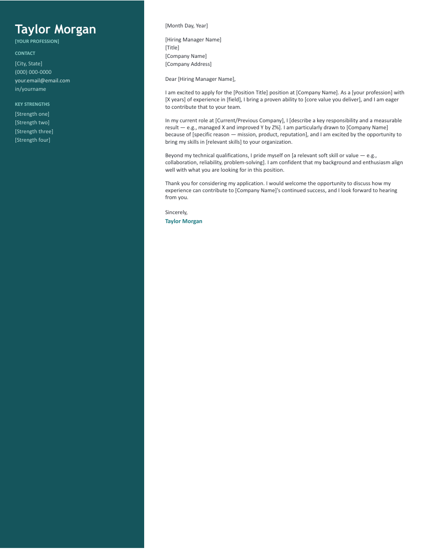
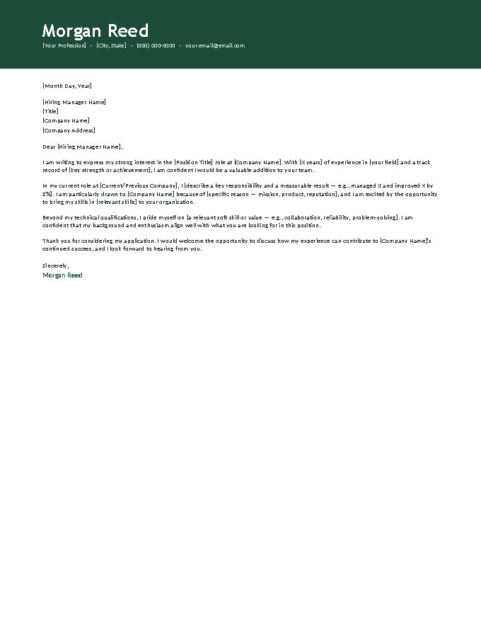
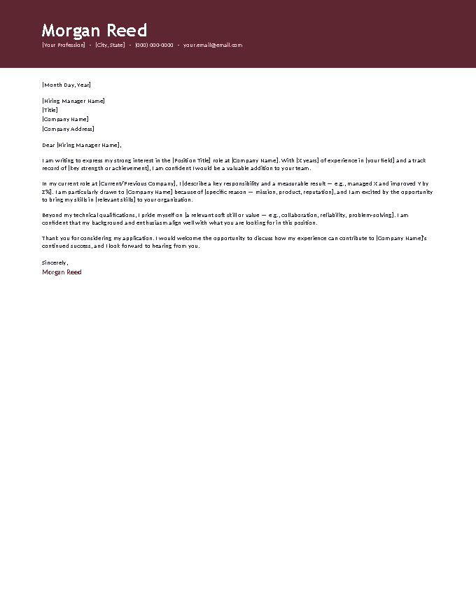
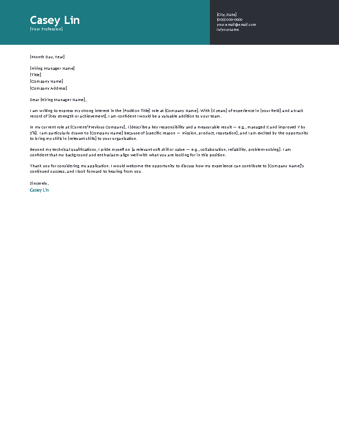
One color move per design — a banner, a split, a rail, a rule — never several at once. Sidebar for product and UX, Banners for marketing and sales, Two-Tone for startups and tech, Contemporary for corporate-adjacent creative roles.
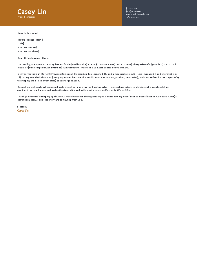
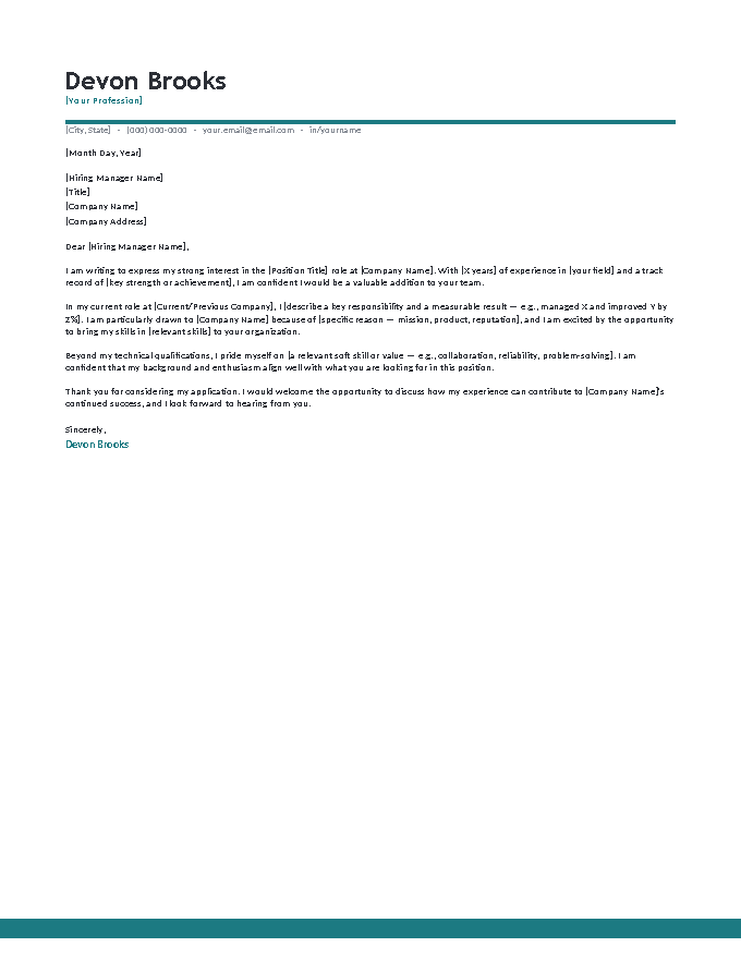
What the modern letter says.
CONTACT
[City, State]
(000) 000-0000
your.email@email.com
in/yourname
KEY STRENGTHS
[Strength one]
[Strength two]
[Strength three]
[Strength four]
[Month Day, Year]
[Hiring Manager Name]
[Title]
[Company Name]
[Company Address]
Dear [Hiring Manager Name],
I am excited to apply for the [Position Title] position at [Company Name]. As a [your profession] with [X years] of experience in [field], I bring a proven ability to [core value you deliver], and I am eager to contribute that to your team.
In my current role at [Current/Previous Company], I [describe a key responsibility and a measurable result — e.g., managed X and improved Y by Z%]. I am particularly drawn to [Company Name] because of [specific reason — mission, product, reputation], and I am excited by the opportunity to bring my skills in [relevant skills] to your organization.
Beyond my technical qualifications, I pride myself on [a relevant soft skill or value — e.g., collaboration, reliability, problem-solving]. I am confident that my background and enthusiasm align well with what you are looking for in this position.
Thank you for considering my application. I would welcome the opportunity to discuss how my experience can contribute to [Company Name]'s continued success, and I look forward to hearing from you.
Sincerely,
Taylor Morgan
Using design as a signal, not a costume.
In visual industries, a designed letter isn’t decoration — it’s a small work sample. Three principles keep it working for you instead of against you:
- Match the employer’s own register. Their website, their job posting, their brand. A startup with an illustrated careers page welcomes a two-tone header; a bank does not. The company shows you the dress code — read it.
- One move, executed cleanly. Every template here makes exactly one design statement. That restraint is what separates “candidate with taste” from “candidate with a template pack.”
- The words still carry it. Color earns the first glance; the first paragraph earns the read. A designed letter with a generic opening is worse than a plain one — the packaging promises what the content doesn’t deliver.
Portfolio fields: if your work is visual (design, content, video), put the portfolio link in the letter’s first or last paragraph where it can’t be missed — that link will do more than any template choice.
Fill it in.
- Open a template in Google Docs or download the Word file.
- Check the employer’s own materials — if they’re colorful, proceed; if conservative, grab a simple template instead.
- Fill the [brackets], keep the design’s single color move untouched, and add your portfolio link if you have one.
- Pair it with a resume of matching energy from the resume library — mismatched formality reads as two different people.
Modern cover letter FAQ
Is it OK to send a cover letter with color?
Which of these designs suits which industry?
Will a designed template cause ATS problems?
How much design personality is too much?
Should my resume match a modern cover letter?
Modern & creative cover letter templates · Updated September 2026