
Professional Cover Letter Templates
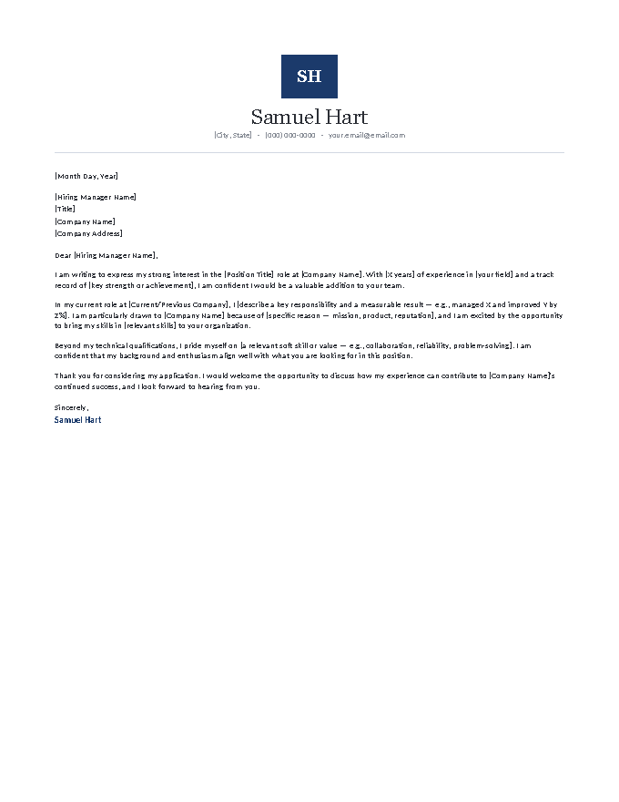
Five cover letter templates with letterhead presence — monogram emblems and executive sidebar rails that read as personal stationery rather than graphic design. Built for applications where presentation is part of the job: consulting, finance, management, client-facing roles. Corporate-appropriate color, careful typography, and the same proper business-letter bones as everything in the library. Word or Google Docs, free.
Five professional templates with quiet presence.
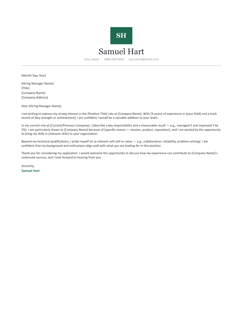
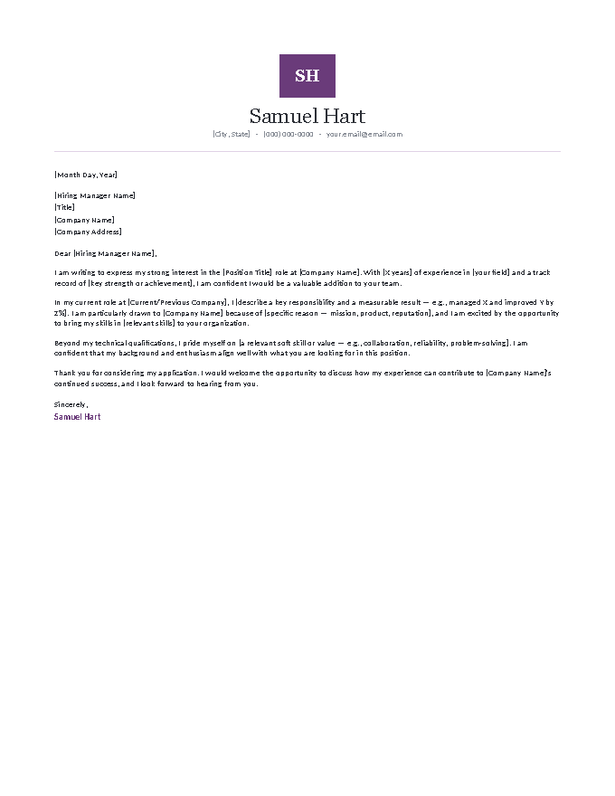
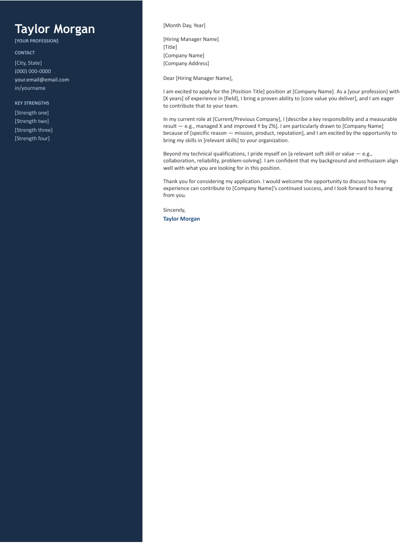
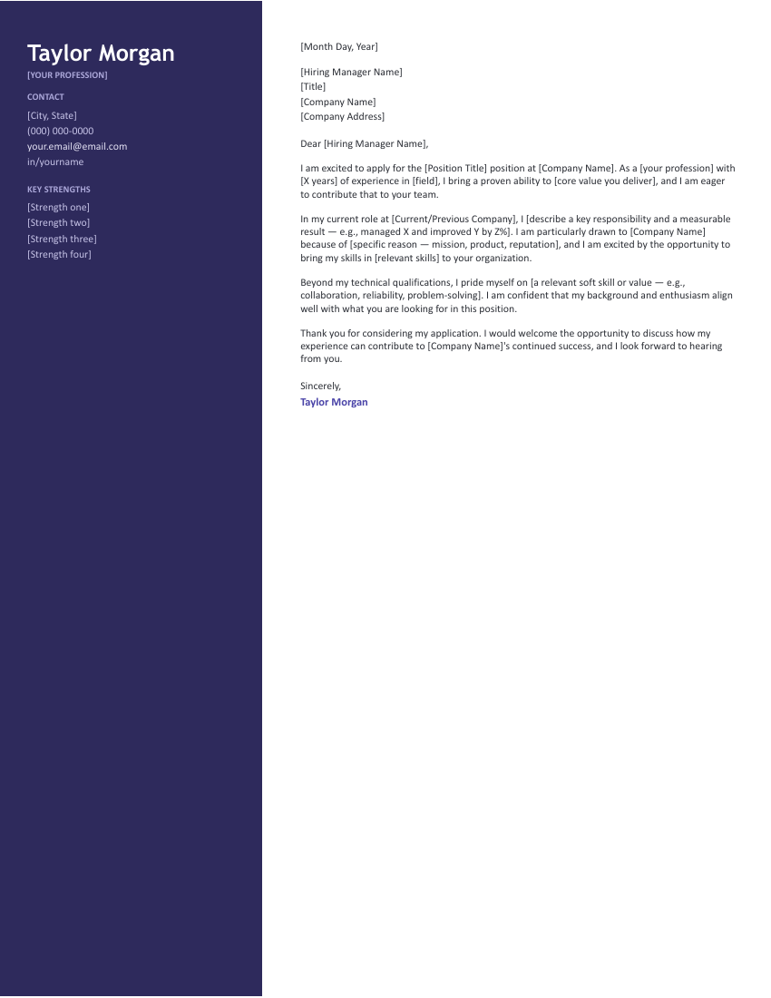
Three Monogram colorways — the engraved-stationery look — and two Executive Sidebar layouts whose full-height rail carries contact details and four key strengths. Polished, corporate, and one page each.
What the professional letter says.
[City, State] · (000) 000-0000 · your.email@email.com
[Month Day, Year]
[Hiring Manager Name]
[Title]
[Company Name]
[Company Address]
Dear [Hiring Manager Name],
I am writing to express my strong interest in the [Position Title] role at [Company Name]. With [X years] of experience in [your field] and a track record of [key strength or achievement], I am confident I would be a valuable addition to your team.
In my current role at [Current/Previous Company], I [describe a key responsibility and a measurable result — e.g., managed X and improved Y by Z%]. I am particularly drawn to [Company Name] because of [specific reason — mission, product, reputation], and I am excited by the opportunity to bring my skills in [relevant skills] to your organization.
Beyond my technical qualifications, I pride myself on [a relevant soft skill or value — e.g., collaboration, reliability, problem-solving]. I am confident that my background and enthusiasm align well with what you are looking for in this position.
Thank you for considering my application. I would welcome the opportunity to discuss how my experience can contribute to [Company Name]'s continued success, and I look forward to hearing from you.
Sincerely,
Samuel Hart
What 'professional' buys you — and where it matters.
Between plain and colorful sits the letterhead letter: designed enough to feel authored, restrained enough for any boardroom. When it’s the right call:
- The job produces documents. Consulting decks, client proposals, board memos — if polished output is the work, your application is a work sample, and typographic care is quiet evidence of competence.
- You’re building a matched packet. A letter and resume sharing a letterhead read as one authored application. That consistency registers subliminally as conscientiousness — the trait every manager hires for.
- Seniority needs signaling. For management and executive-adjacent roles, the sidebar’s strengths rail functions like a title block: four capabilities visible before the first sentence is read.
The line to respect: professional means one accent color, no icons, no photos, no design elements that compete with the text. The moment a letterhead asks for attention instead of lending credibility, you’ve crossed into territory better served by the modern collection — deliberately, for the right industry.
Fill it in.
- Open a template in Google Docs or download the Word file.
- Monogram templates: set your initials in the emblem. Sidebar templates: fill the four strengths with capabilities echoed from the posting.
- Complete the [brackets] in the body — role, company, results, and the company-specific line.
- Pair it with a matching professional resume so the packet shares one letterhead language.
Professional cover letter FAQ
What makes a cover letter look professional?
Which fields expect this level of polish?
Is a monogram too much for a job application?
Professional versus simple — which should I pick?
Do the sidebar layouts survive ATS parsing?
Professional & business cover letter templates · Updated September 2026