
Apollo's Templates
HomeLetterheadExamples
Letterhead

Letterhead Examples

Twenty-six real letterhead designs, drawn from thirteen industries, with a note on why each one is laid out the way it is. Every example is a free download for Microsoft Word and Google Docs.

Worked examples

26 letterhead examples, by industry

Each links through to its category, where the full set is free to download in both Microsoft Word and Google Docs.
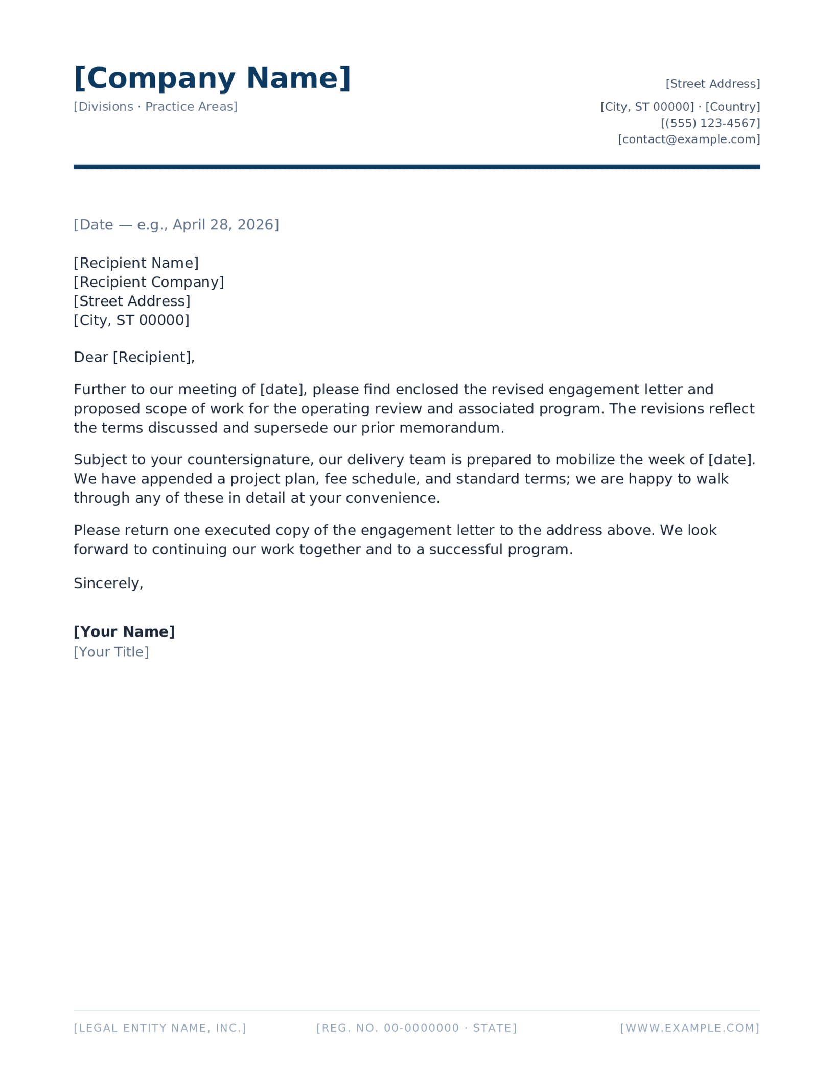
Split corporate masthead with the wordmark left, address right and a navy rule beneath a REF and DATE line
Company

Corporate Blue Split Header

The default business layout: identity left, contact right, one rule to separate the head from the letter.

See the company set
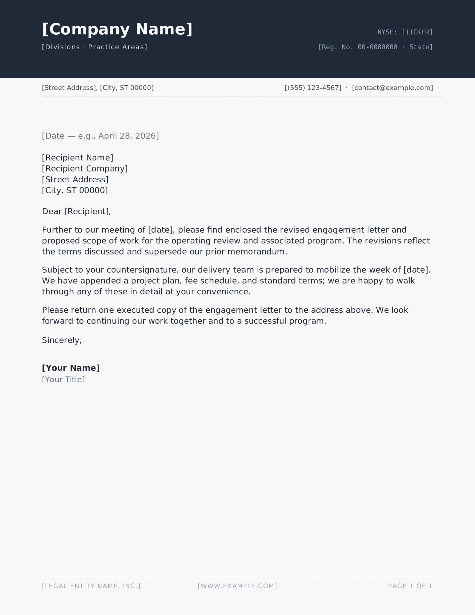
Solid charcoal band with a company name reversed out in white above a ticker and established line
Company

Charcoal Block Header

A reversed-out band reads as larger and more confident than the same name in black on white.

See the company set
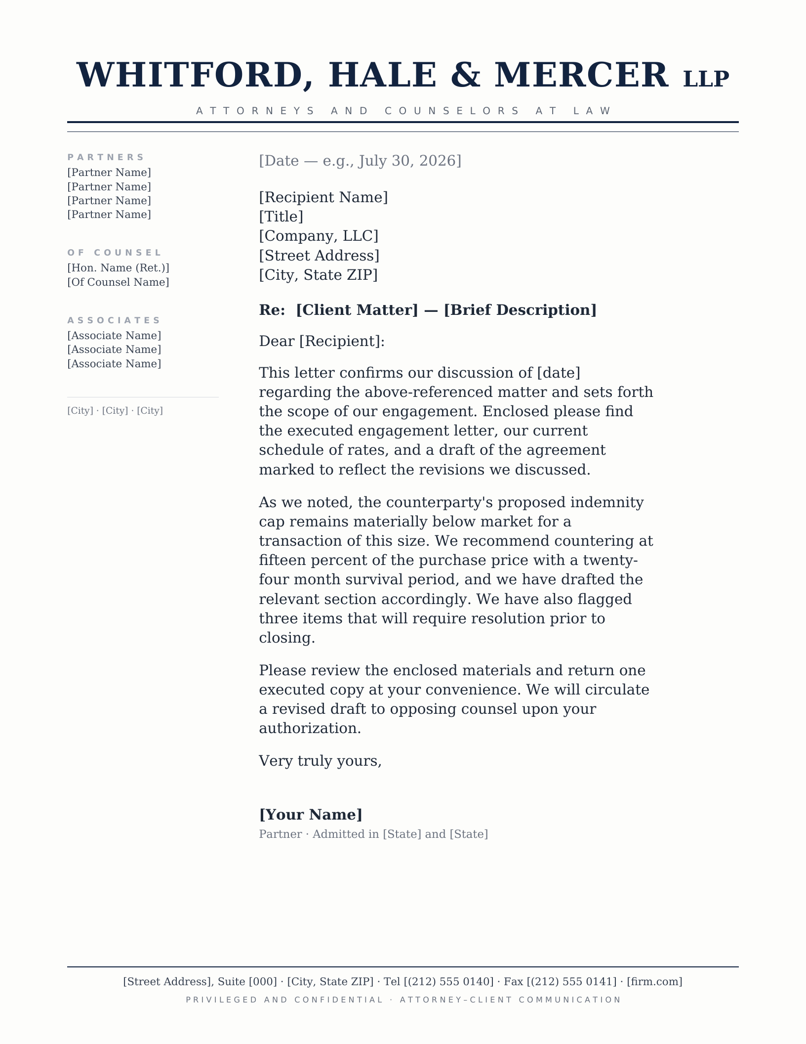
Centred serif firm name over Attorneys and Counselors at Law, with the full partner and associate roster down the left margin
Legal

Law Firm Partner Roster

The traditional large-firm masthead. The left rail exists because bar rules in several states expect named attorneys to be listed.

See the legal set
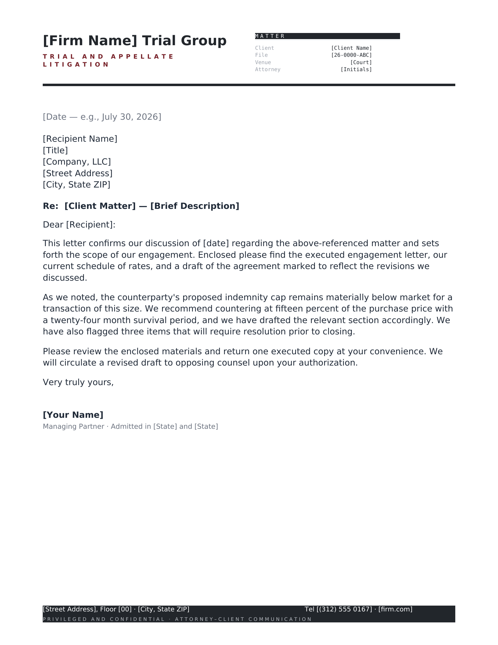
Litigation letterhead with a boxed matter block ruled for case caption, court, docket number and our file reference
Legal

Litigation Matter Block

A boxed reference block is worth more than decoration when every letter has to carry a docket number.

See the legal set
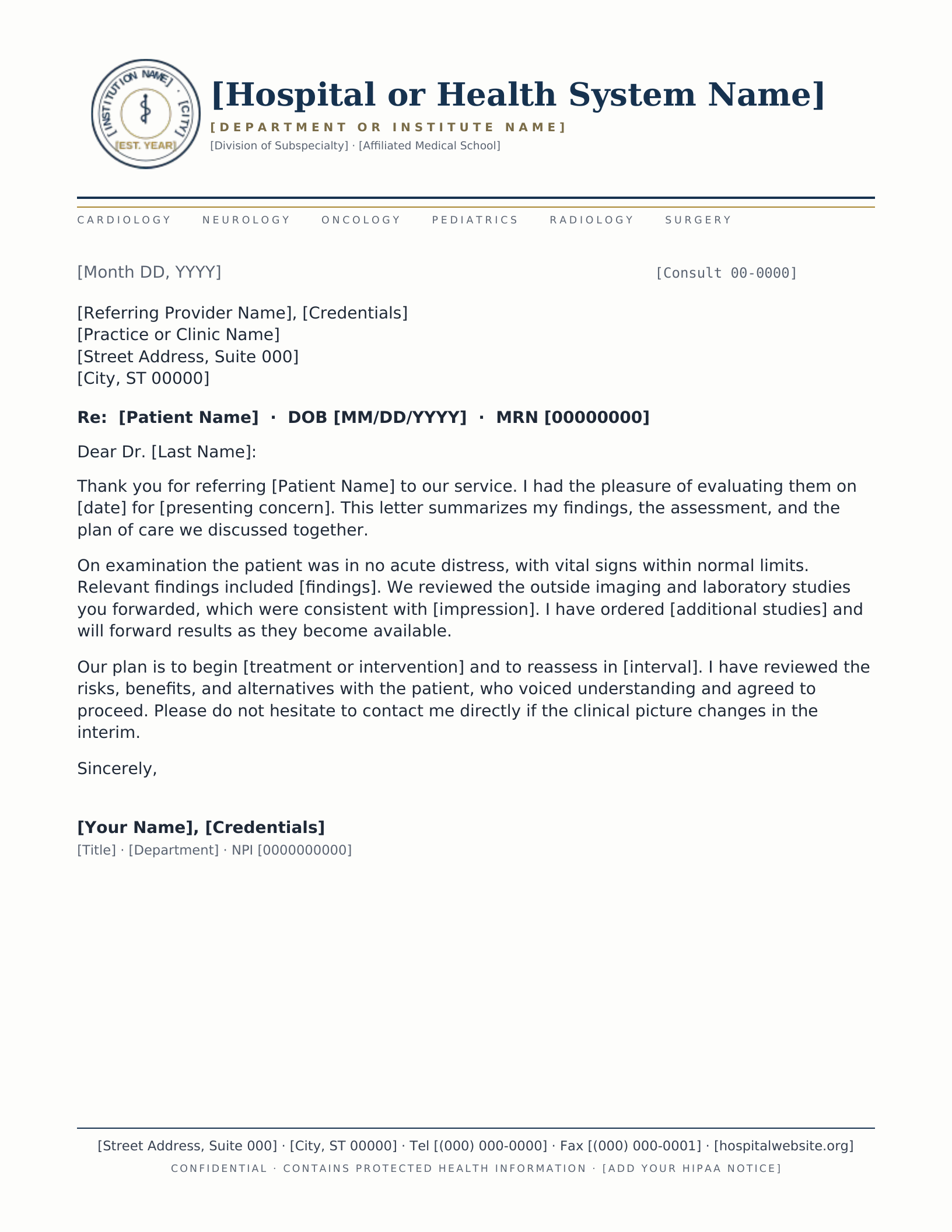
Drawn institutional seal with a department line and division rail, set opposite a consult number and date
Medical

Academic Medical Center

Teaching hospitals sign letters at department level, so the department line sits above the individual clinician.

See the medical set
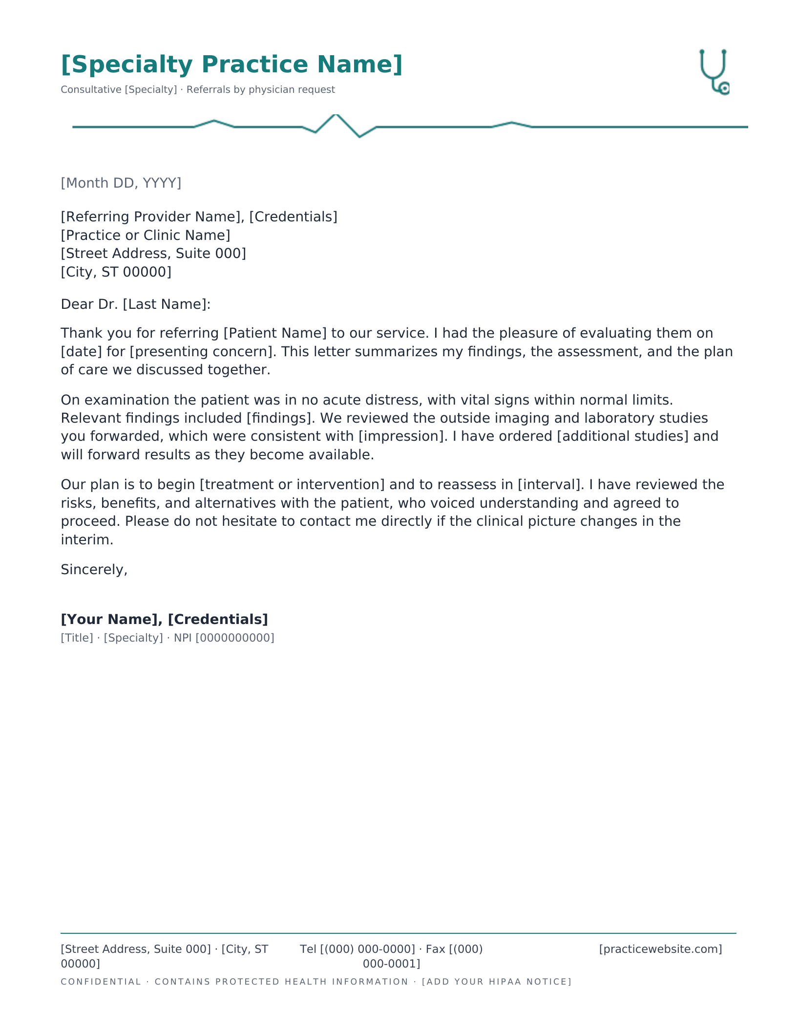
Stethoscope mark and pulse rule above a Re line carrying patient name, date of birth and record number
Medical

Specialist Referral

Built around the Re line, because a consult reply is read by someone looking for the patient identifier first.

See the medical set
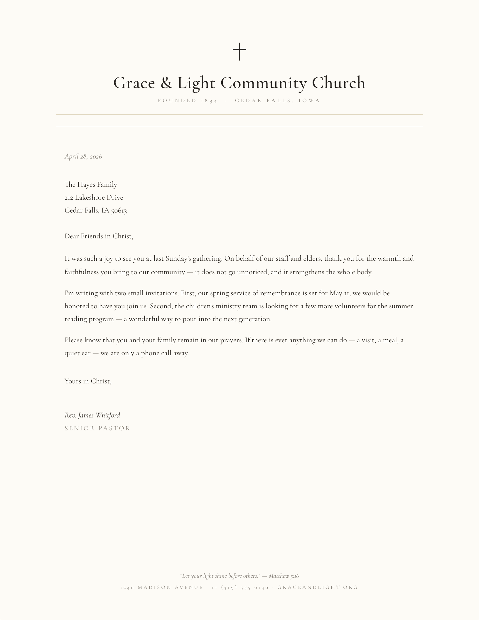
Drawn Latin cross above a centred serif church name, with an established line and paired hairline rules
Church

Classic Parish, Latin Cross

Centred and symmetrical. Congregational letters are usually read as coming from the church rather than a person.

See the church set
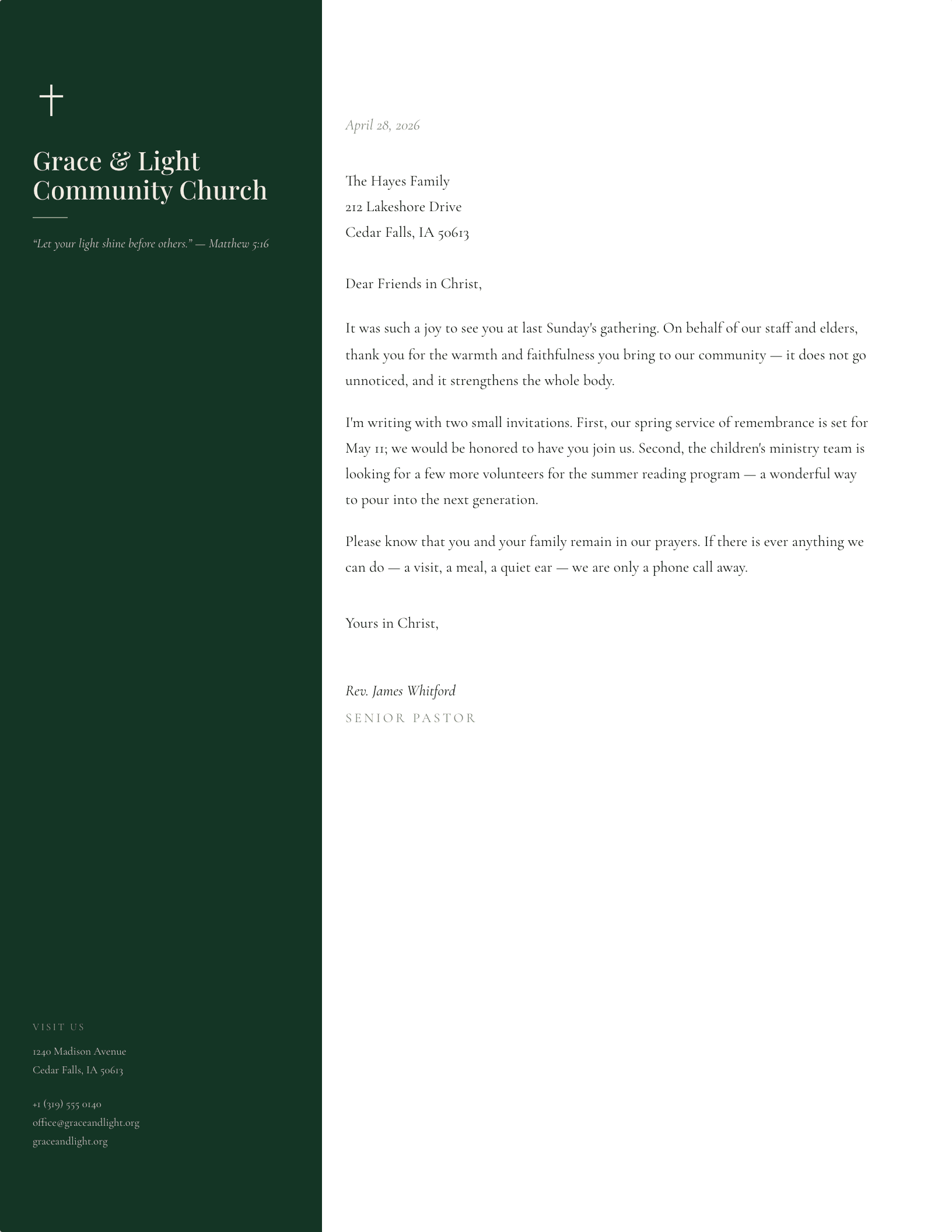
Evergreen left rail carrying the church name, an italic Matthew verse and the address, beside a cream letter
Church

Sidebar with Verse

A full-height rail is the one layout that gives a standing quotation somewhere permanent to live.

See the church set
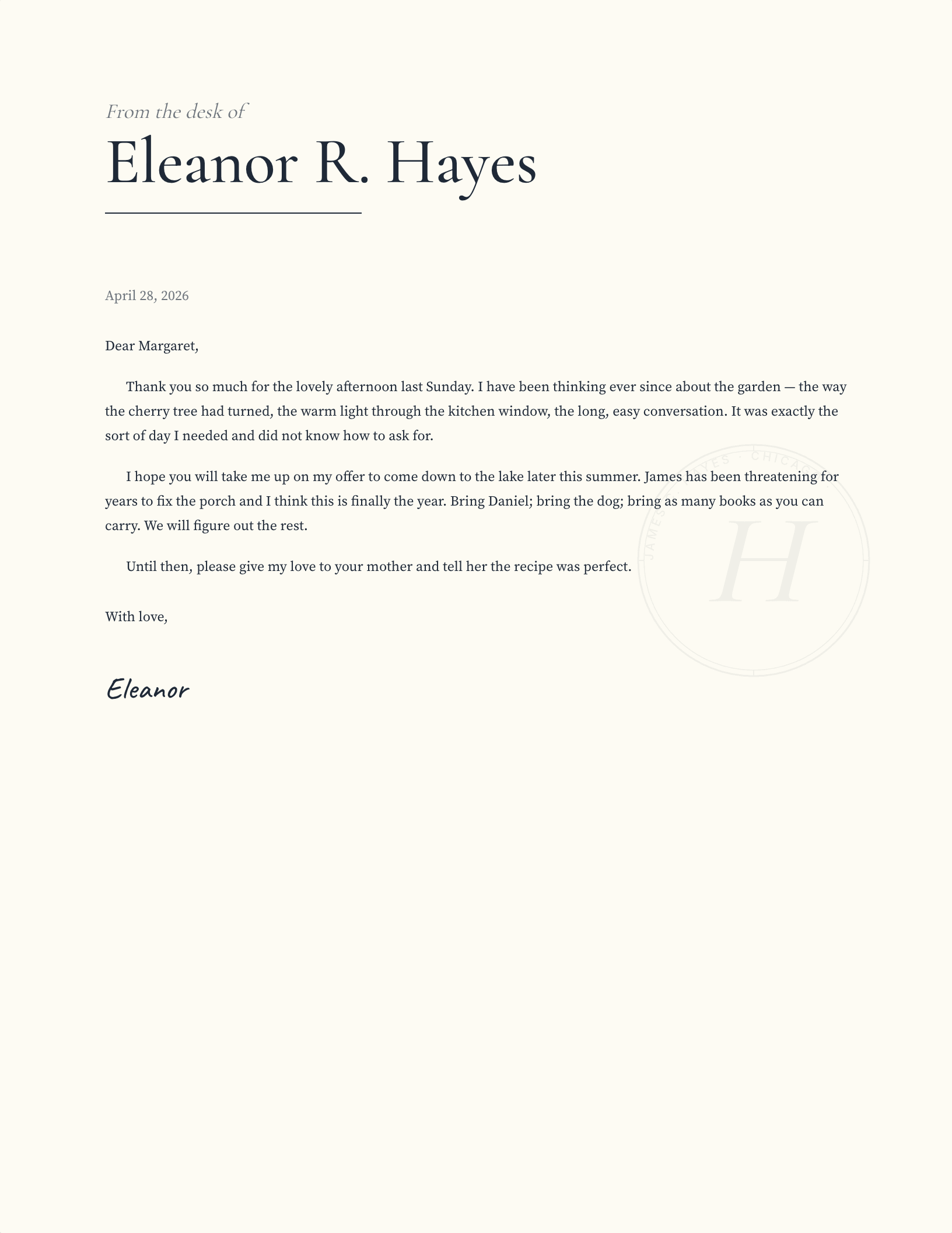
Small italic From the desk of tag above a large display serif name finished with a hairline rule
Personal

From the Desk Of

The oldest convention in personal stationery, and still the clearest way to say a note is informal.

See the personal set
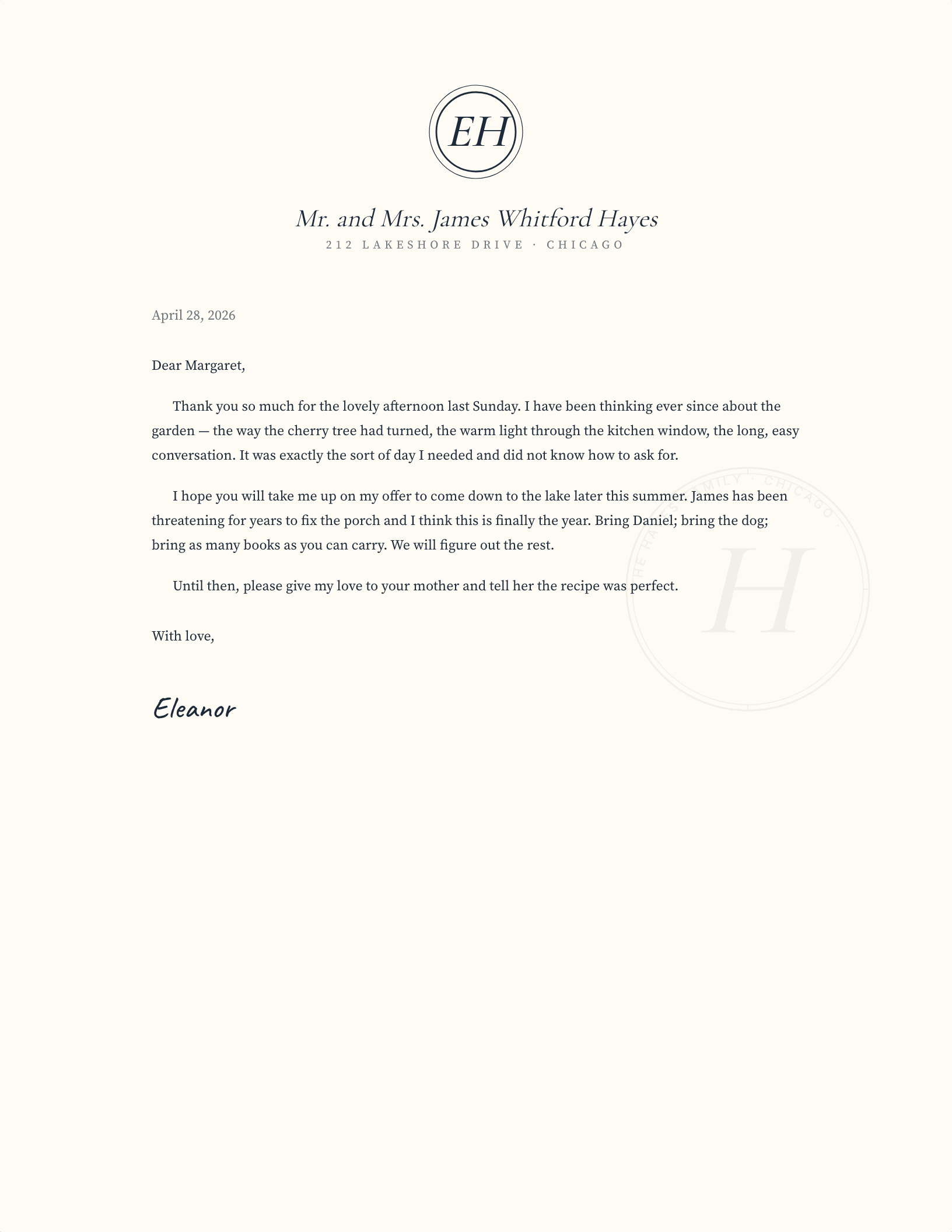
Centred double-ring ornamental monogram above an italic display name, traditional household stationery
Personal

Engraved Monogram

Household stationery traditionally leads with the mark and puts the address at the foot, not the head.

See the personal set
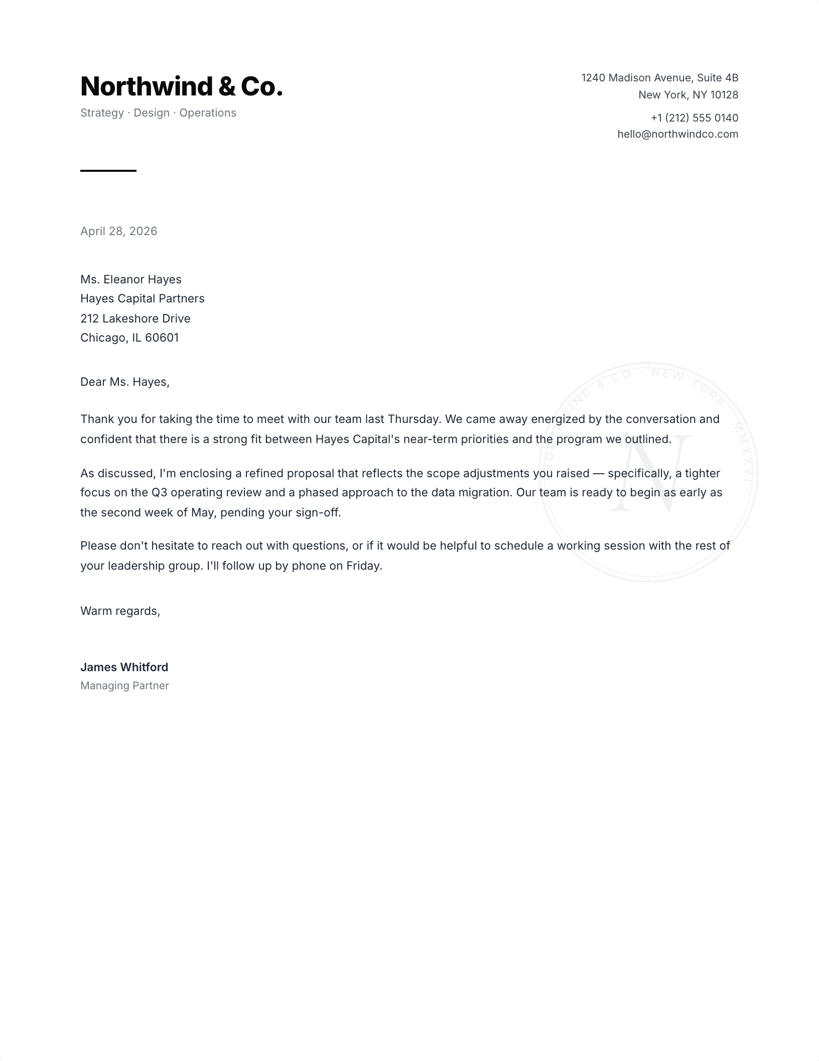
Bold sans wordmark left, contact strip right, navy rule beneath, in a clean horizontal masthead
Modern

Modern Sans Split Header

The most copied contemporary layout, because it survives being printed badly.

See the modern set
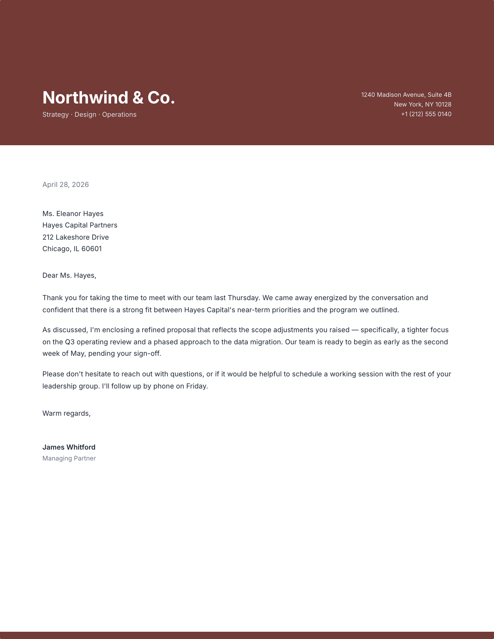
Terracotta band with the company name reversed out in white above a tracked tagline
Modern

Two-Tone Colour Block

One saturated band is usually the whole design budget. A second colour almost always makes it worse.

See the modern set
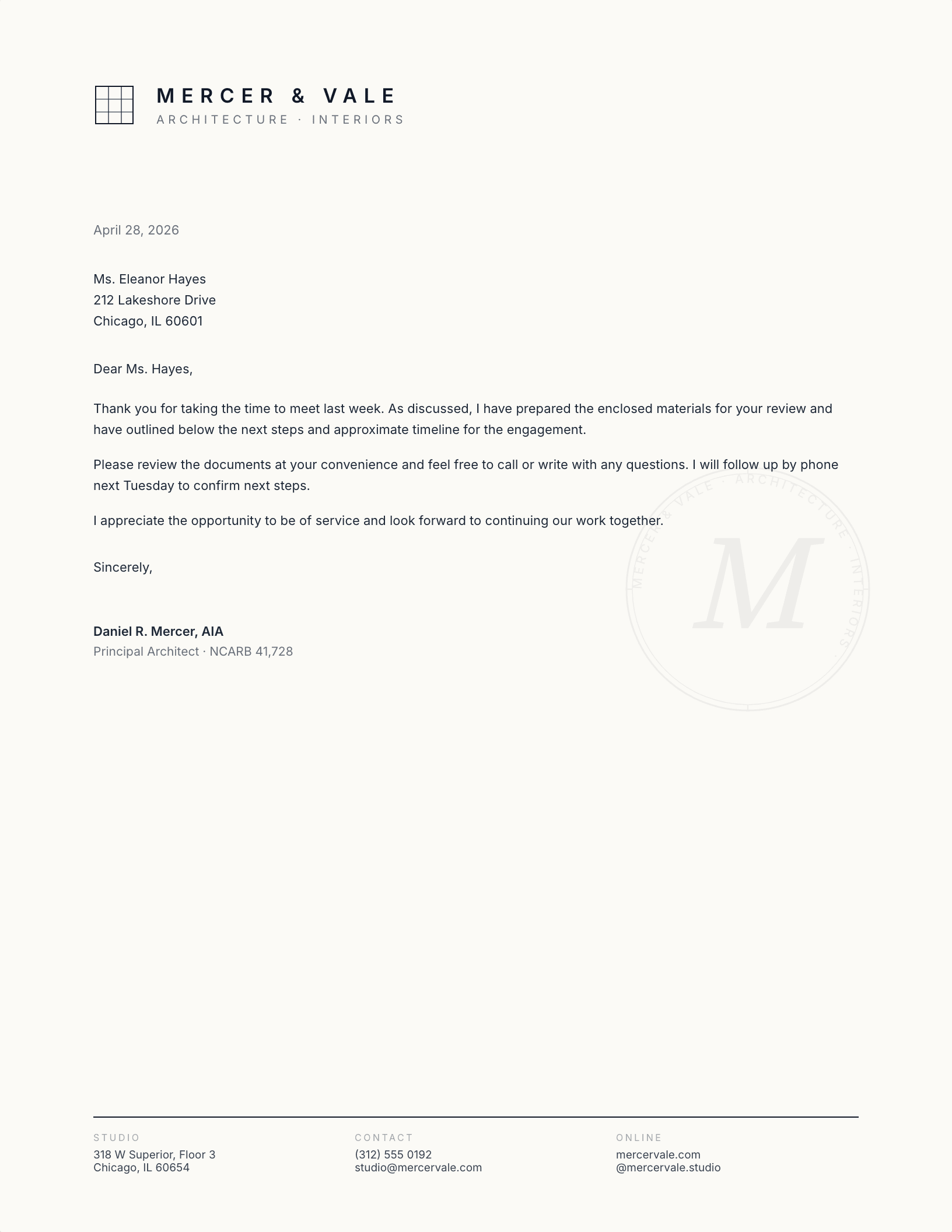
Wide-tracked studio name beside a four-by-four grid mark, with a three-column ink-rule footer
Professional

Architecture Studio Grid Mark

Wide letter-spacing and a lot of white space is how design practices signal that restraint is deliberate.

See the professional set
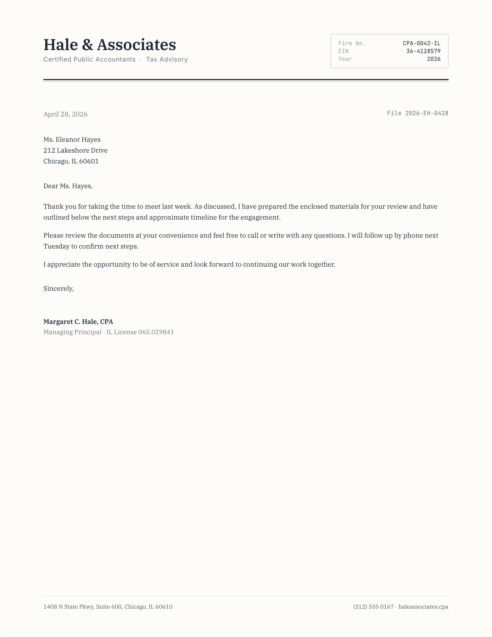
Serif accounting firm name beside a bordered monospace data box carrying firm number, EIN and year
Professional

CPA Tabular Header

Monospaced figures in a ruled box read as numerate. On an accounting letter that is the whole point.

See the professional set
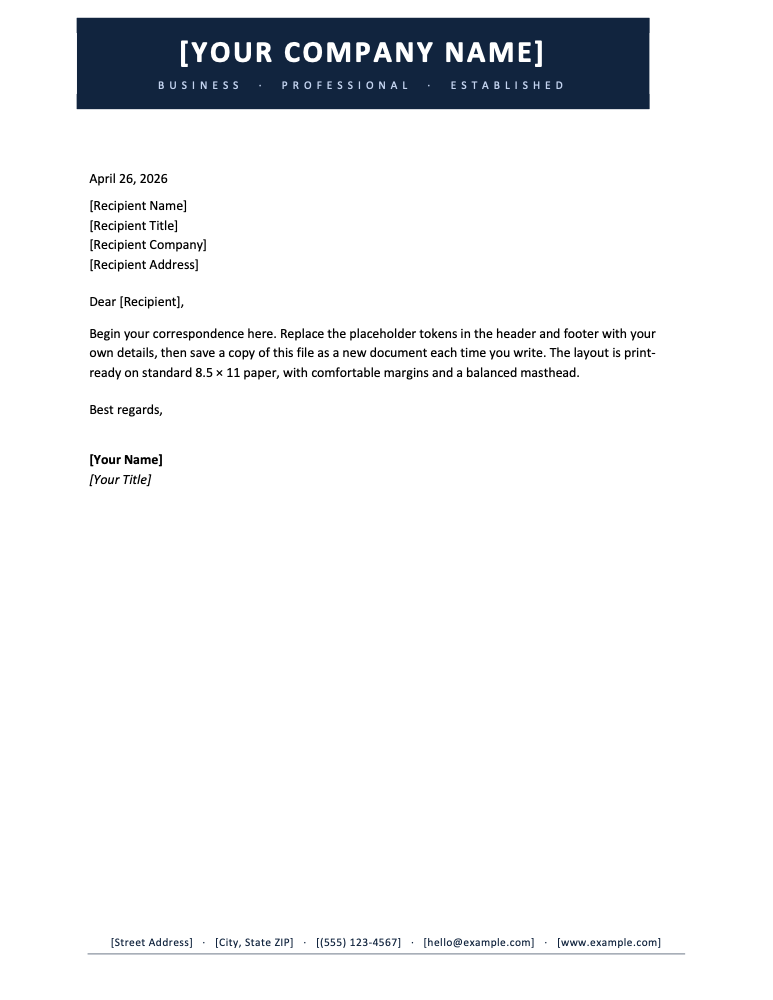
Full-width navy band with the organization name reversed out and a tracked mission tagline
Nonprofit

Bold Corporate Band

A tagline band gives a mission statement a fixed home so it does not compete with the salutation.

See the nonprofit set
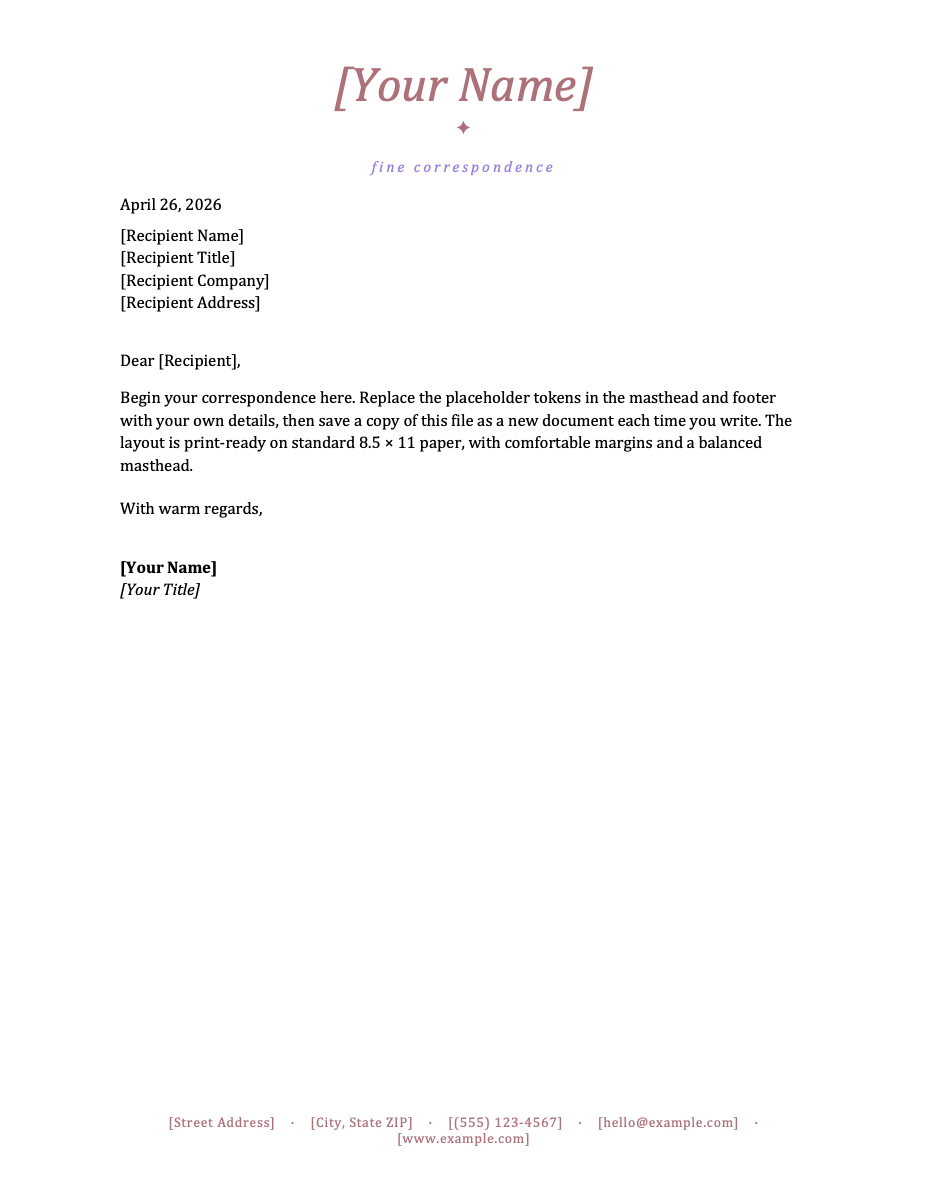
Italic serif masthead with a rose-gold ornament over a serif body, for boutique and personal brands
Nonprofit

Elegant Script Masthead

Script works on a thank-you letter and fails on an invoice. Match the face to the letter you send most.

See the nonprofit set
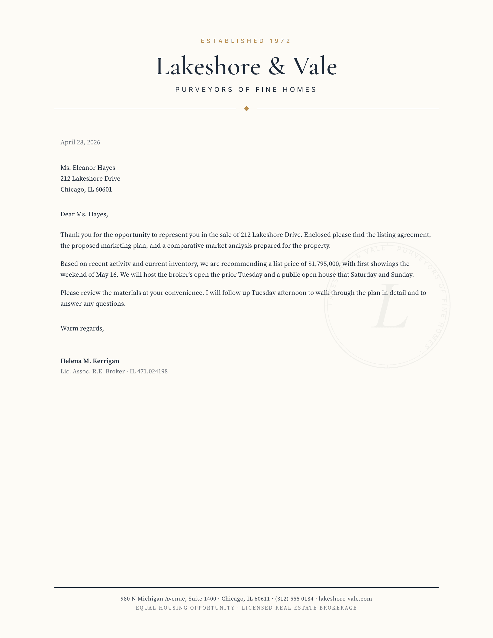
Drawn house silhouette above an italic estate name and a tracked gold purveyors of fine homes subline
Real estate

Luxury Estate House

A drawn mark beats a photograph here: it prints at any size and does not date the way a property shot does.

See the real estate set
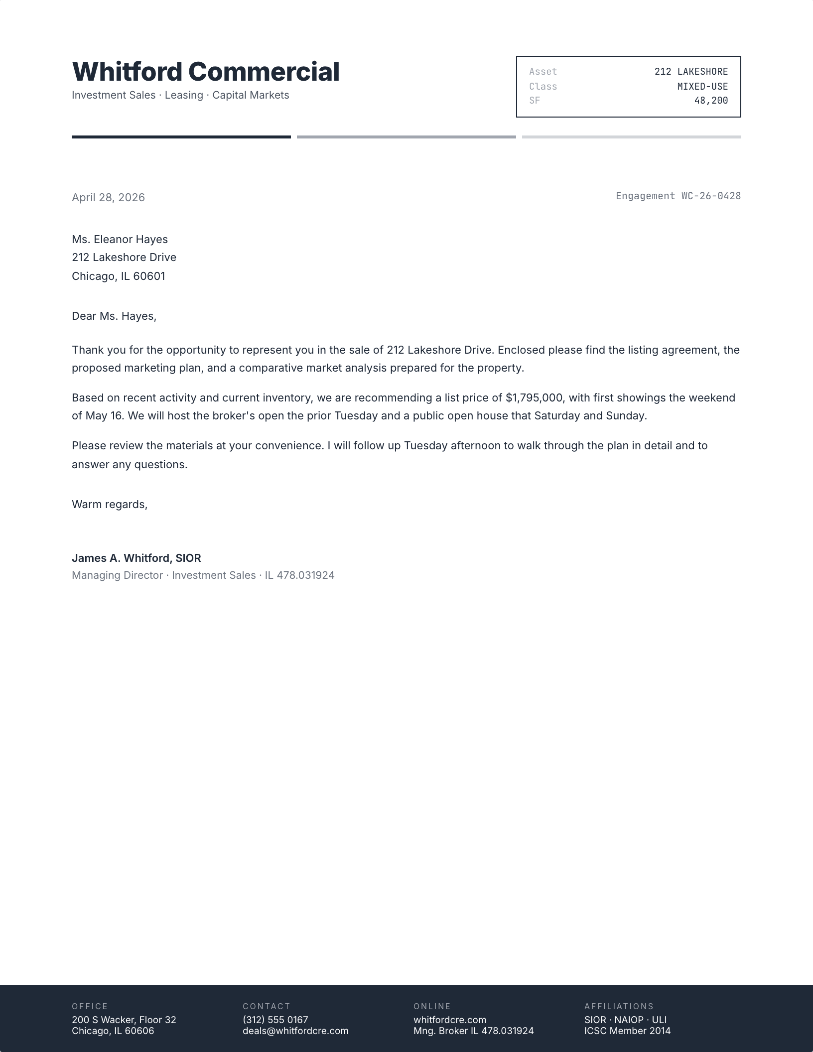
Bold slate firm name above a pale data block reading commercial, investment, asset management and advisory
Real estate

Commercial Real Estate Data Block

Listing service lines across the head is the CRE convention, and it saves explaining them in the first paragraph.

See the real estate set
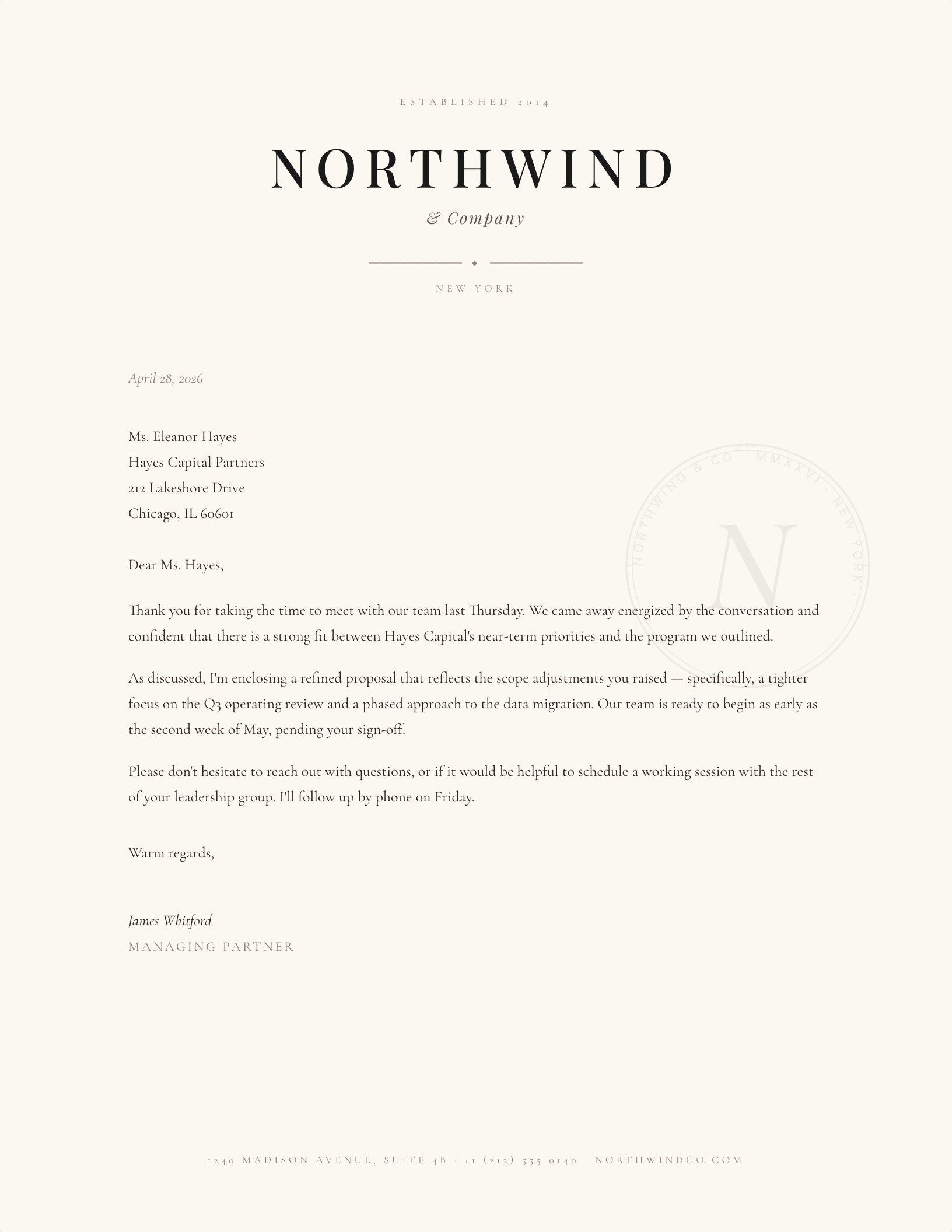
High-contrast Didone capitals centred over an ornament line and a tracked establishment subline
Elegant

Didone Centred, Engraved

High-contrast faces need size to work. At small sizes the thin strokes disappear on a home printer.

See the elegant set
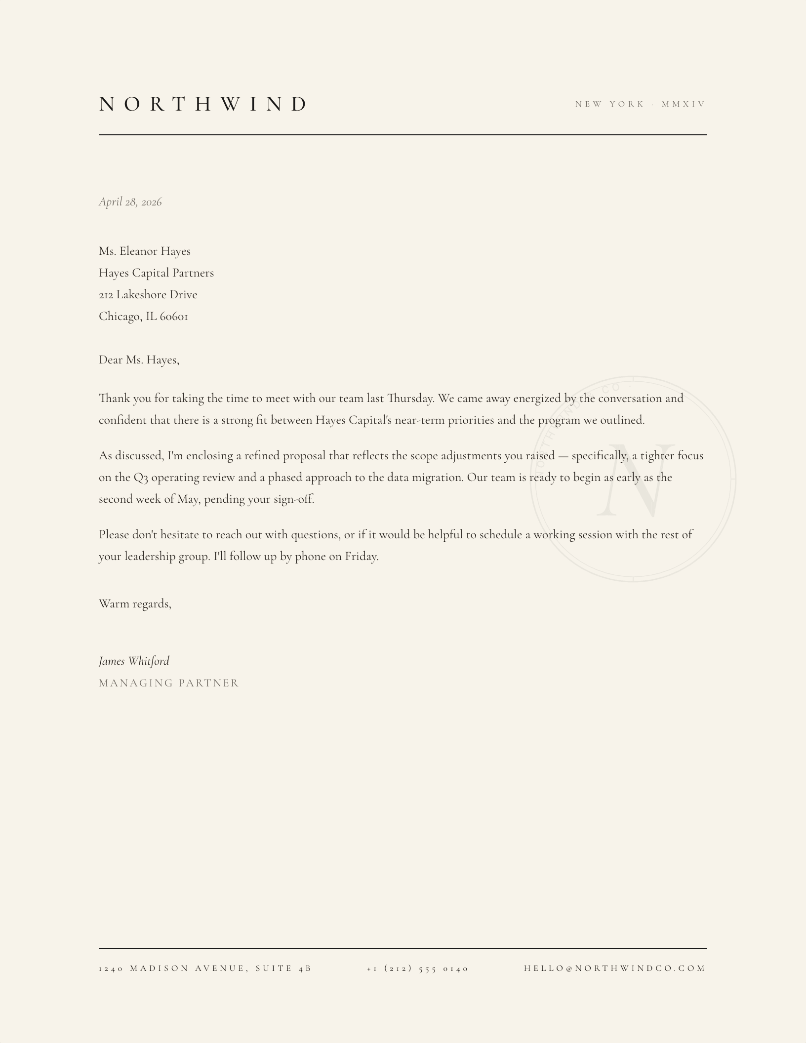
Widely letterspaced black capitals on cream with a tracked address beneath and no ornament at all
Elegant

Letterspaced Caps on Cream

No mark, no rule, no colour. The most formal option in the library is also the simplest to reproduce.

See the elegant set
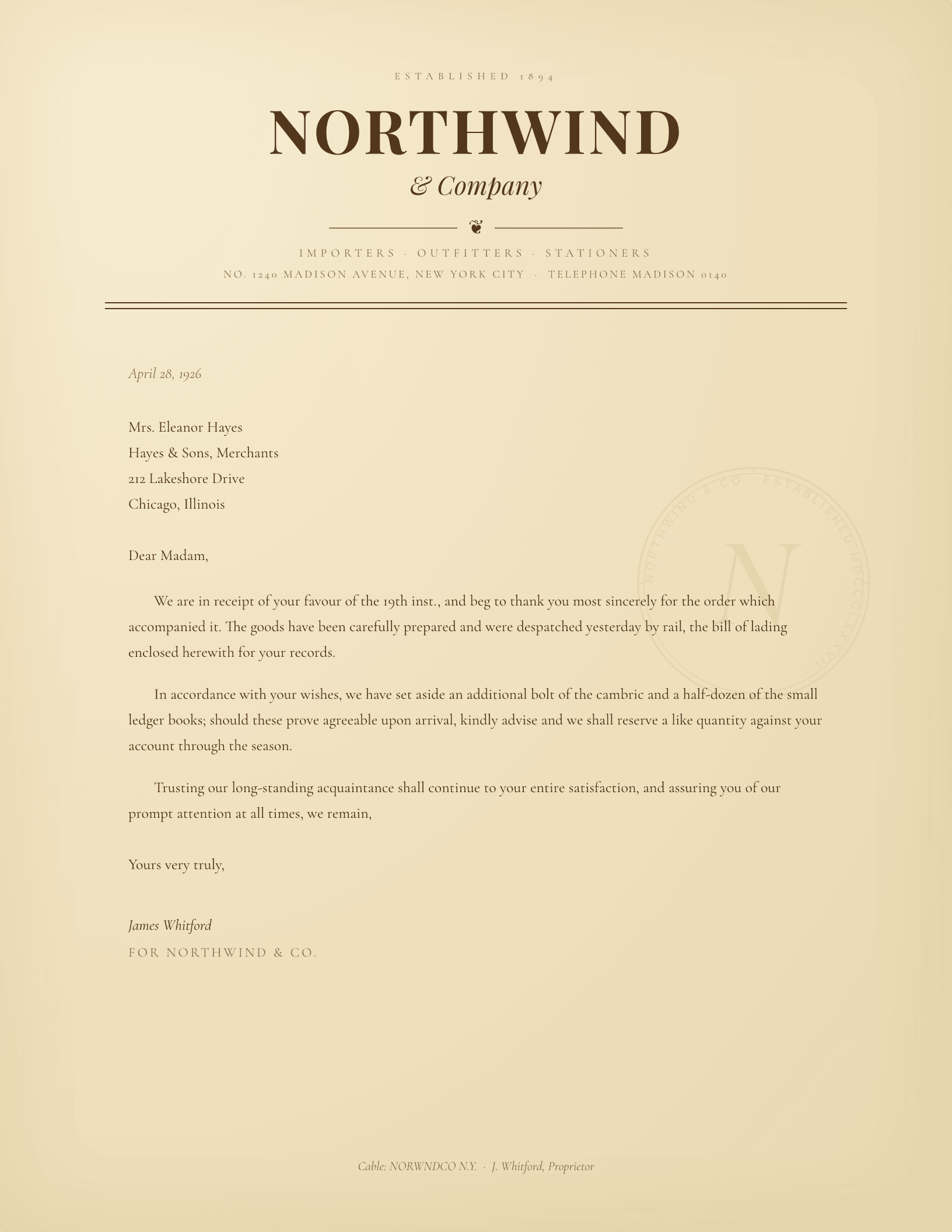
1890s ESTABLISHED lockup with a serif company name and an italic purveyors of wares subline
Vintage

Mercantile Establishment, 1890s

Period letterheads carried the trade in the masthead because the name alone rarely explained the business.

See the vintage set
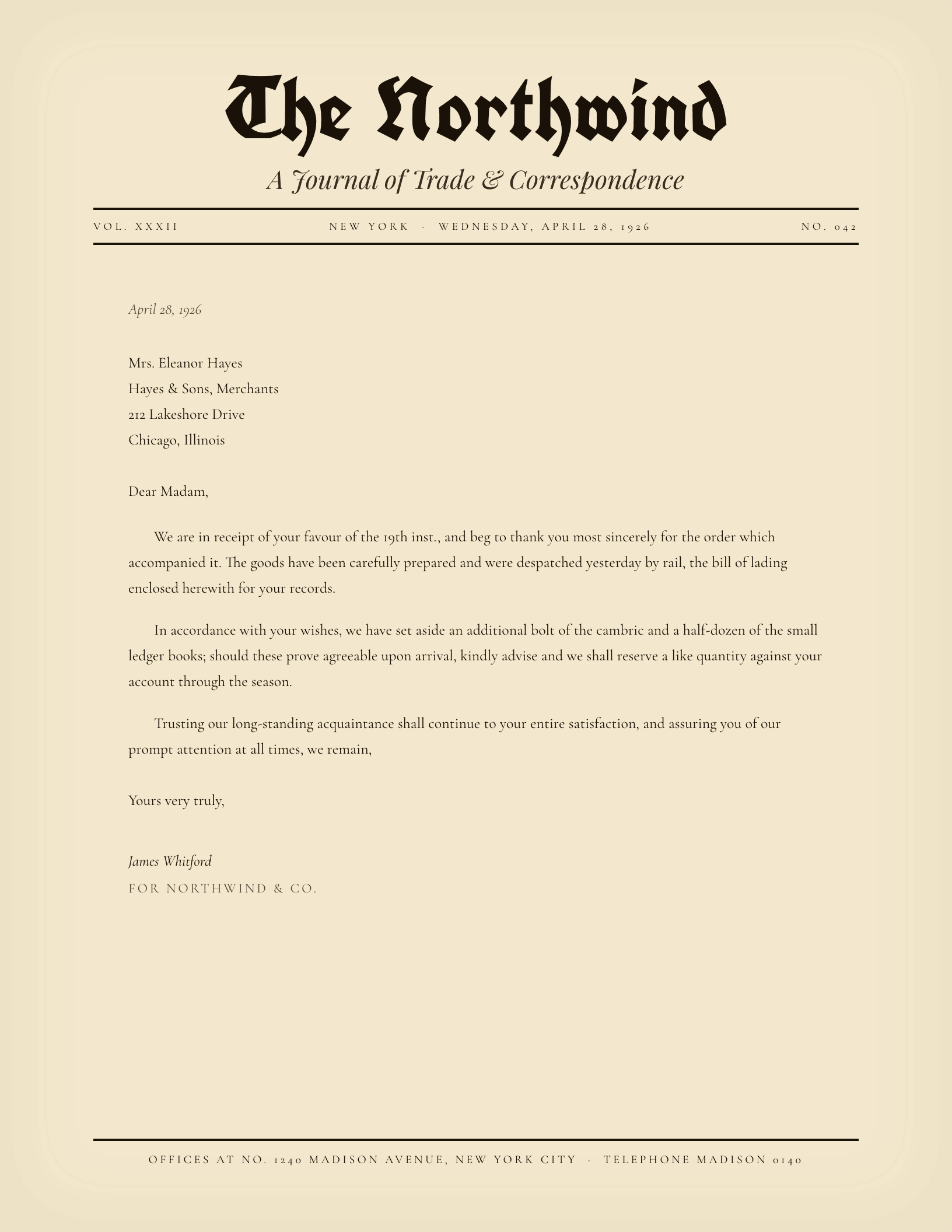
Large newspaper masthead over a thick rule and a volume, number, date, city and price line
Vintage

Newspaper Masthead

The volume and number line is what makes this read as a masthead rather than just a big name.

See the vintage set
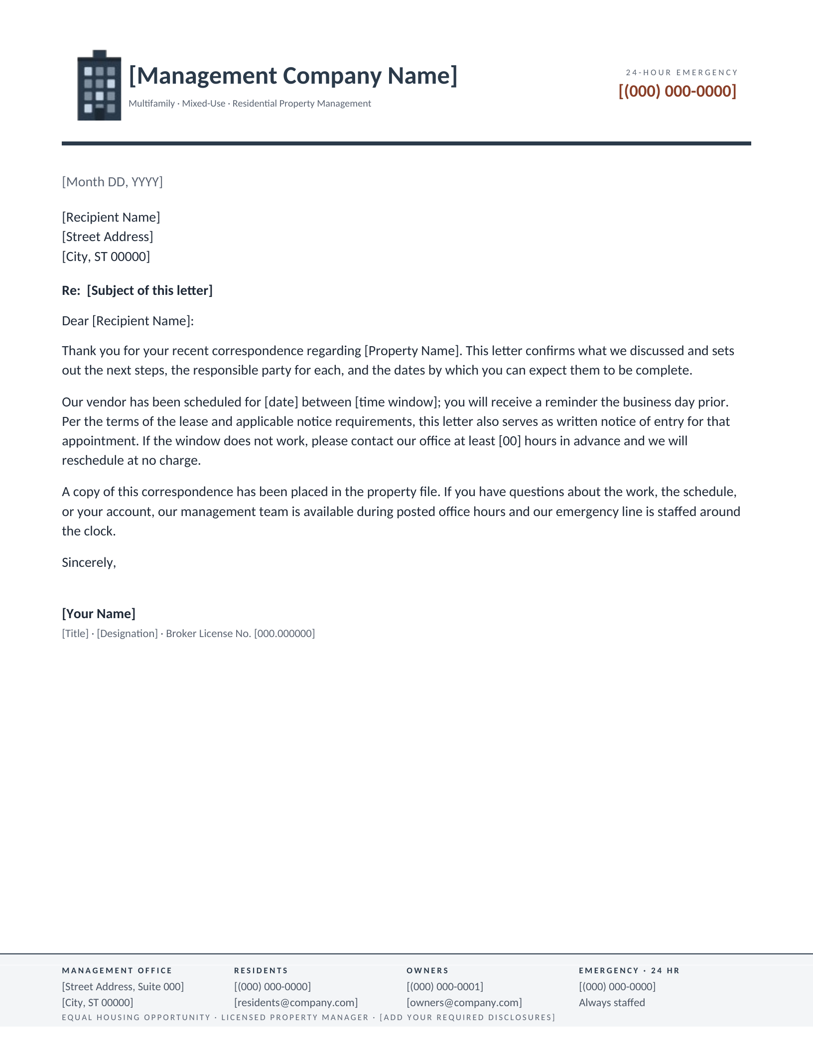
Apartment-block mark above a four-column footer reaching residents, owners and a 24-hour emergency line
Property management

Residential Multifamily

Four audiences, one sheet. The footer does the work a property manager would otherwise repeat in every letter.

See the property management set
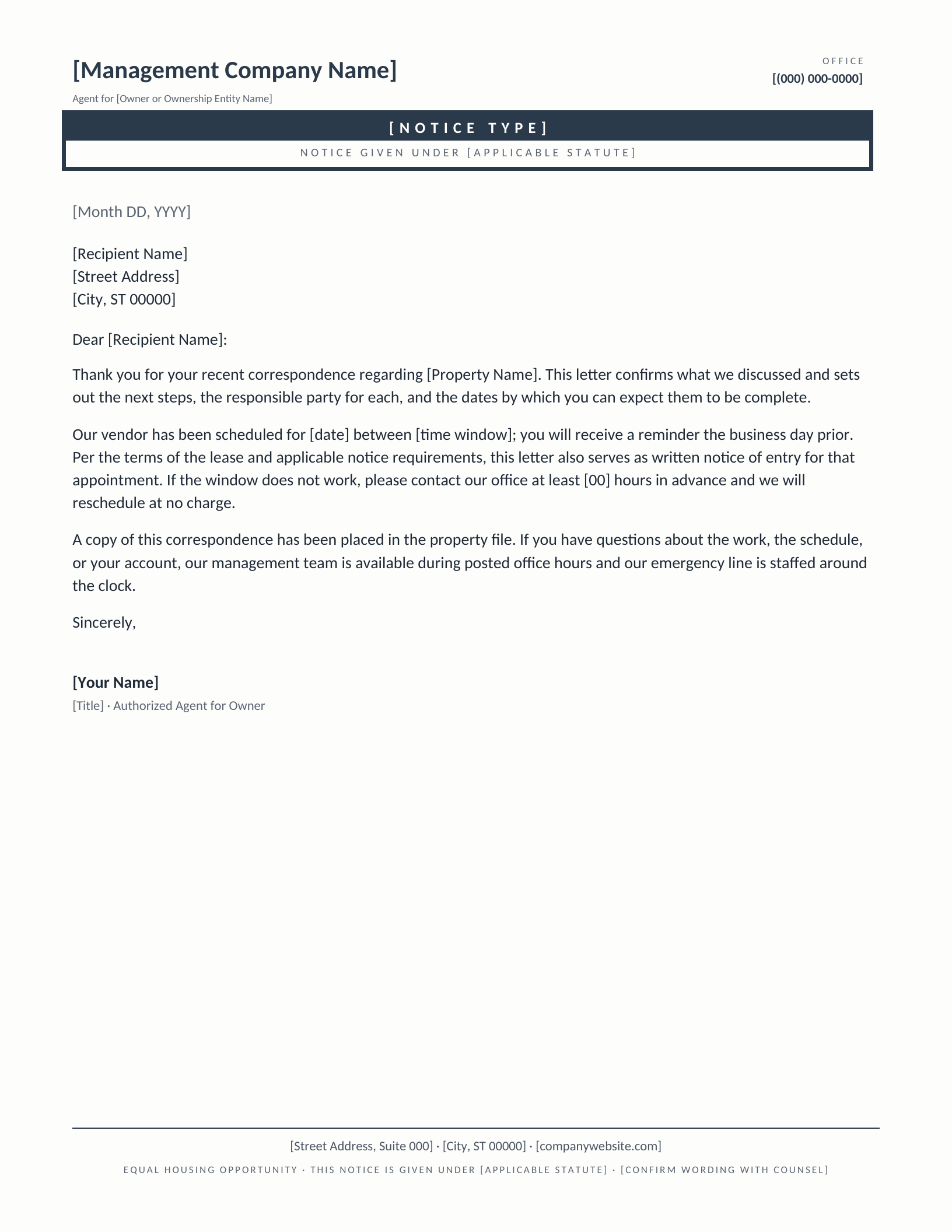
Boxed notice banner above a line naming the statute the entry or lease notice is given under
Property management

Formal Notice

A notice has to look unlike ordinary correspondence, or it gets filed as ordinary correspondence.

See the property management set
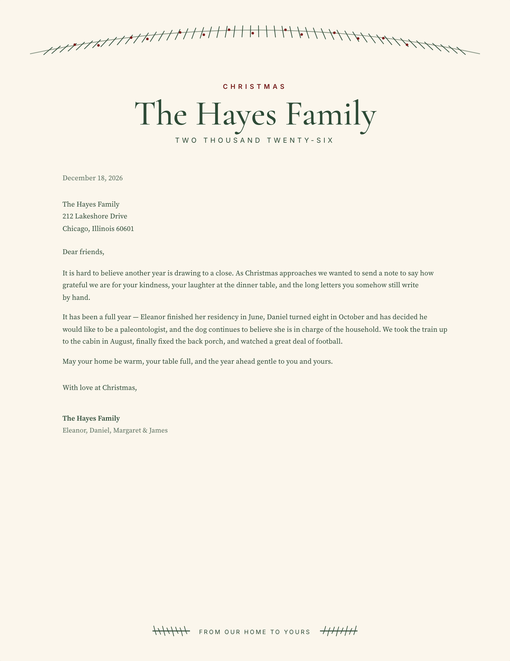
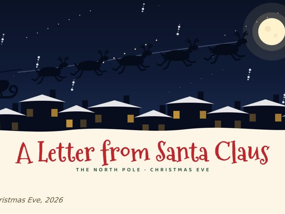
Layered evergreen garland with red berries, pinecones, a gold star and a red bow arched above a family name
Christmas

Evergreen Swag

Seasonal art belongs at the head, above the family name — never behind the text, where it fights the reading.

See the christmas set
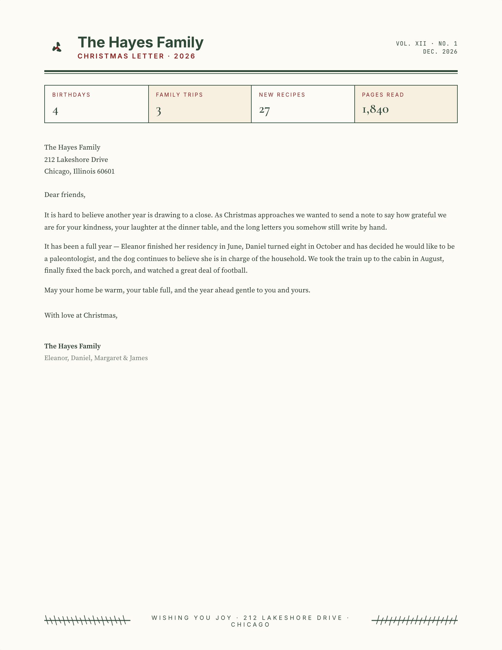
Newsletter-style Christmas masthead with holly, heavy rules and a gold star above a long family letter
Christmas

Year in Review Newsletter

For the long annual letter. A masthead sets the expectation that there is more than one paragraph coming.

See the christmas set
Reading a letterhead

What every example above has in common

Strip the ornament from any of the twenty-six and the same three parts are left: something that names the sender, something that says how to reply, and a horizontal break that stops the heading bleeding into the letter. The break might be a rule, a band of colour, or nothing but white space — but it is always there, because without it the reader has to work out where the letter starts.

The differences between them are mostly about which facts earn a place in the heading. A solo practitioner needs a direct line. A clinic needs an after-hours number. A property manager needs an emergency line and a portal address, which is why the multifamily example carries a four-column footer instead of a single address line. When a design looks over-built it is usually carrying facts the sender does not actually need on every letter.

One practical constraint shapes all of them. A heading that runs deeper than about two and a half inches pushes the date, the inside address and the salutation far enough down the page that a short letter looks stranded in the lower half. Every example above keeps the head under that depth.

Common questions

Letterhead format, size and how to make one

What is a letterhead?

A letterhead is the heading at the top of a sheet of correspondence that identifies who the letter is from — typically a name or company name, an address, and a way to reply. It is printed or set on every page of stationery so the reader knows the source of the letter before reading a word of it. In a word processor, a letterhead template is a document that carries that heading already positioned, leaving the body free for the letter itself.

What size is a letterhead?

In the United States a letterhead is US Letter — 8.5 × 11 inches, portrait. Most of Europe, Australia and Asia use A4, which is 210 × 297 mm, slightly narrower and slightly taller. Every template on this page is US Letter. The heading itself normally occupies the top 1.5 to 2.5 inches of the sheet, leaving room for a date, an inside address and the opening of the letter above the fold.

What should a letterhead include?

At minimum: the name of the person or organisation sending the letter, and at least one way to reply — a postal address, a telephone number, an email address or a website. Beyond that, include only what the letters you actually send require. A law firm may need named attorneys; a contractor may need a licence number; a clinic may need a confidentiality notice. Anything that does not earn its place makes the heading harder to read.

How do you make a letterhead in Microsoft Word?

The quickest route is to start from a template rather than a blank page. Download any design here as a .dotx file and open it — Word creates a fresh document from the template and leaves the original intact, so the next letter starts clean. Replace the bracketed placeholders with your own details. To build one from scratch instead, use Insert → Header, place your name and contact details there, then File → Save As and choose Word Template (.dotx) so it can be reused.

How do you make a letterhead in Google Docs?

Open any design here with the Google Docs link and choose Make a copy — the copy lands in your own Drive with the layout intact. Edit the placeholders and it is ready. Building one from scratch is similar to Word: Insert → Headers and footers → Header, then add your details. One thing to know: Google Docs only shows headers and footers when print layout is on, under View → Show print layout, so a footer that looks missing is usually just hidden.

Is a letterhead the same as a letterhead template?

Not quite. The letterhead is the printed heading itself. A letterhead template is the reusable file that produces it — in Word, a .dotx that spawns a new document each time it is opened, so the master is never overwritten. The distinction matters in practice: editing and saving a plain .docx gradually destroys the original, which is why every Word download here is a template rather than a document.

Updated through September 2026.

Keep going

Browse the full library

All 131 letterhead templatesCompany letterheadProfessional letterheadPersonal letterheadMonogram letterhead makers