

Monogram Letterhead
Every monogram letterhead we make, gathered in one place. Type any initial from A to Z, choose from fourteen monogram fonts, set the ink to black and gold, rose gold, burgundy or anything you like — then download the monogrammed letterhead stationery for Word or Google Docs with the mark baked in as a precision-rendered graphic.
Common questions
How large should my monogram be for letterhead?
Between about half an inch and one inch tall for a masthead monogram — roughly 36 to 72pt. Below half an inch the mark stops reading as a monogram and starts looking like a bullet; above an inch it competes with your own name for attention. Every design here is already set in that range, and the A-/A+ control moves it within it rather than outside it. A full-page watermark monogram is the exception: those are meant to be four to six inches and very pale, so the letter behind the text reads as paper rather than as content.
Which monogram fonts can I use, and are they free?
Fourteen faces, all free to use in what you download: Cormorant, Bookman, Cinzel, Limelight, Uncial, Tangerine, Great Vibes, Dancing Script, Caveat, Courier Prime, Tinos, Arimo, Bungee Inline and Black Ops. Between them they cover the range people usually mean by monogram fonts — engraved serifs for formal stationery, scripts for personal and wedding use, and heavier upright faces for a more masculine or industrial mark. You are not installing anything: the font is rendered into the artwork before you download, so it looks identical on every machine.
Can I make a black and gold monogram?
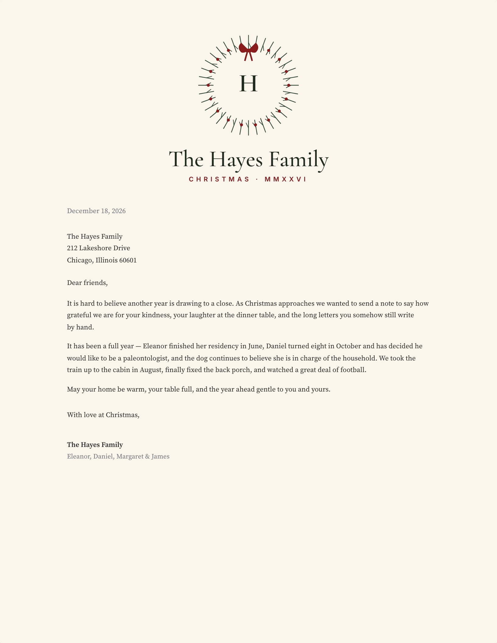
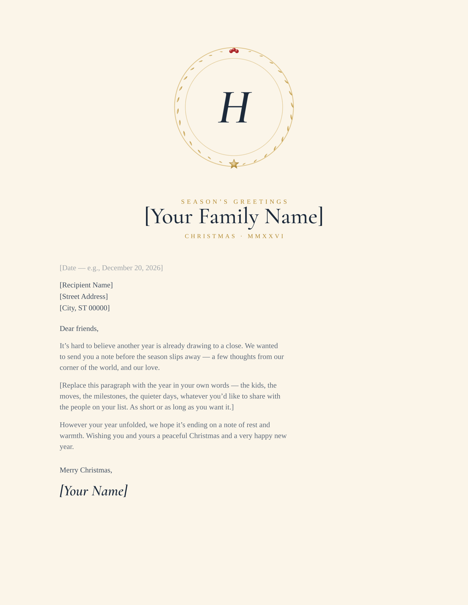
Yes. The colour control sets the ink on every design, so black and gold, rose gold, burgundy, navy or forest are all a click apart. Two designs pair your ink with a fixed metallic ring — the burgundy double ring and the gold medallion — so setting the ink to black gives you the classic black and gold monogram against a gold accent.
What initials work best in a monogram letterhead?
One or two initials read most cleanly at letterhead scale. Traditional personal stationery uses the surname initial alone; couples often use both first-name initials. Each design recenters the mark automatically, so narrow letters like I and wide pairs like MW both sit correctly.
Why do the designs bake the monogram in as a graphic?
Word and Google Docs cannot visually center a letter inside a drawn shape — every glyph has different side bearings, so plain centering leaves some letters floating and others crowding the ring. We render your initials into the mark with pixel-precise centering instead, so the monogram always sits exactly right.
Can I change the monogram after downloading?
The monogram itself is an embedded image, so to change initials, font, or color, come back to this page and download a fresh copy — it takes seconds. Everything else on the page (name, address, letter text) stays fully editable in Word or Google Docs.
Which monogram style should I pick?
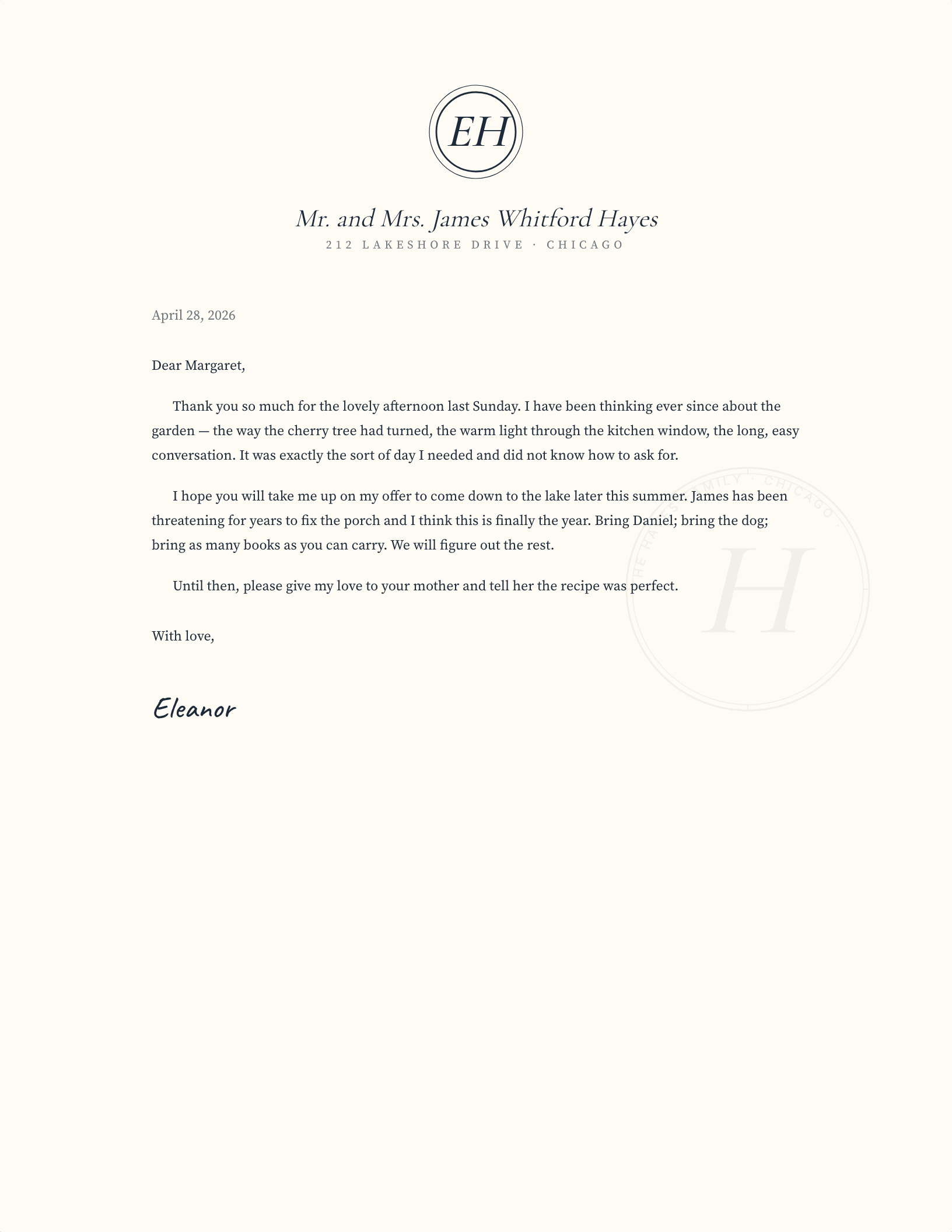
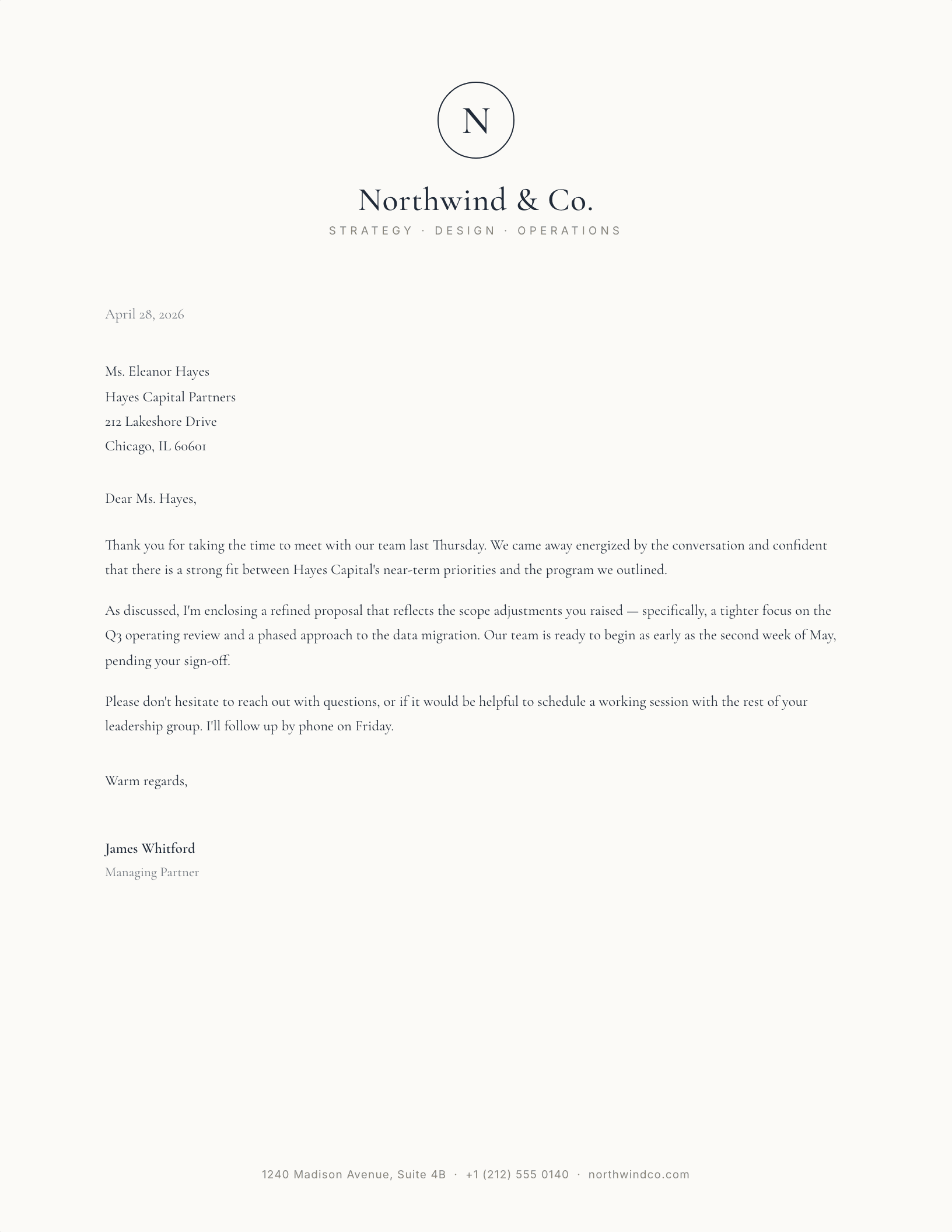
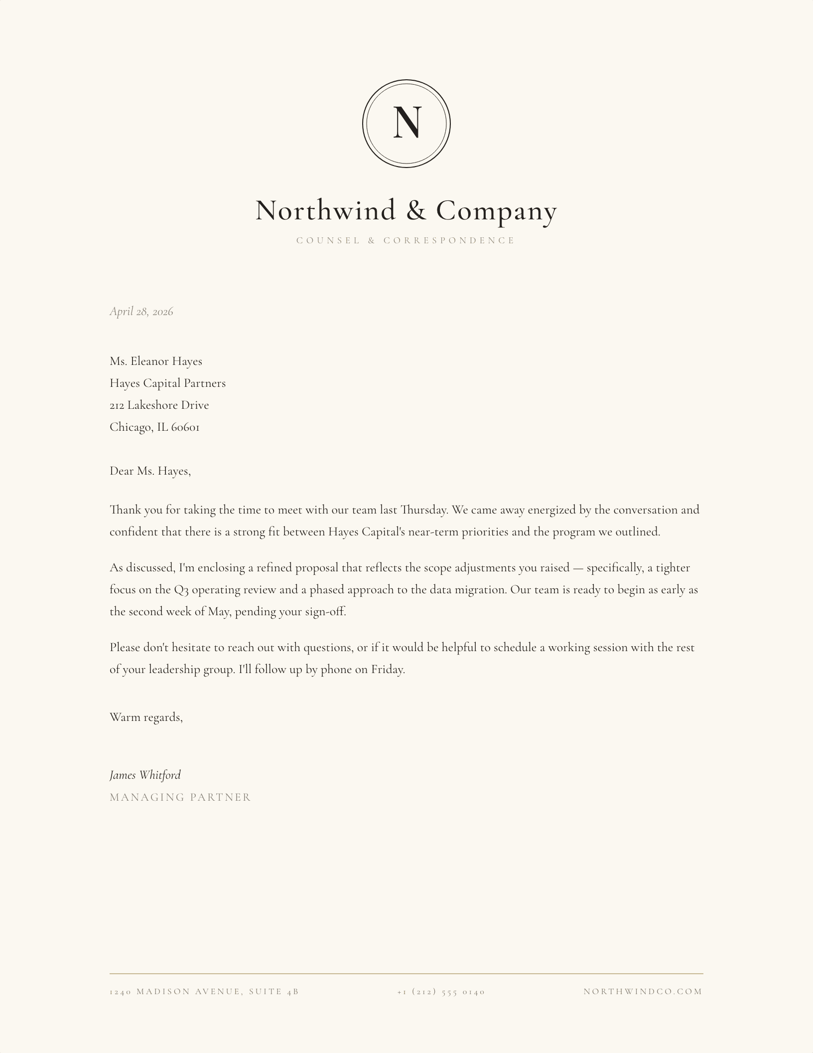
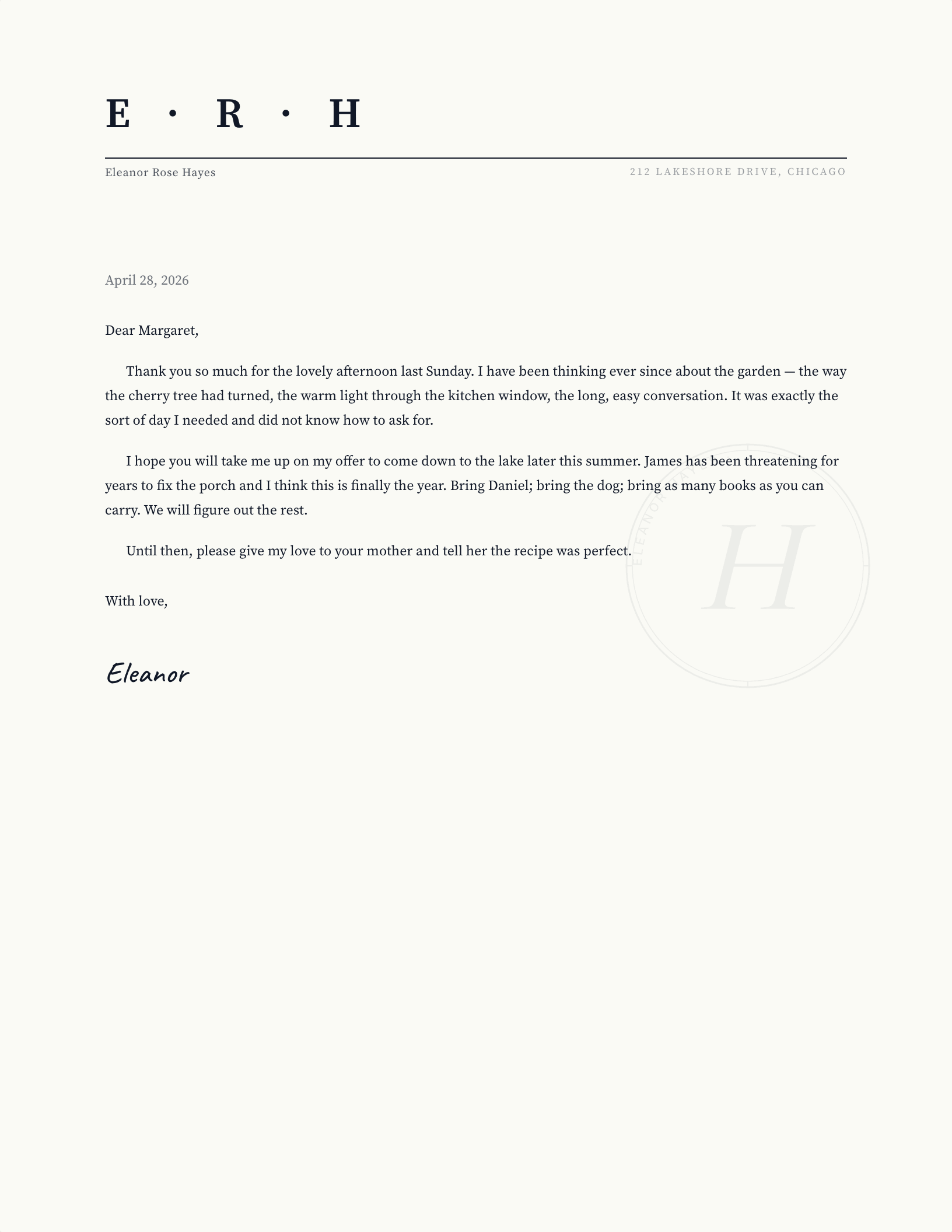
The engraved double-ring is the classic couples and household choice; the circle serif mark reads boutique-professional for a business; the crest monogram adds an heirloom feel with its gold accent ring; letterspaced initials are the most modern and minimal.
The monogram collection is actively maintained — designs updated through September 2026.